
 Hey everyone ! I have such a backlog of games and makeup to review , so let’s review the adorable Olori 2! I really wanted this palette but I held off and getting it . My fiance surprised me one day last year with the Olori 1 and Olori 3 , but the Olori 2 was sold out. then a few months later it was restocked ! and while I swatched it and wore a few times I really didn’t get to take pictures or post my looks with it. Until now that is.
 As with all the Olori palette’s it’s a nice smaller size than some of the other Juvia’s Place palettes with only six shades in the whole palette , but there’s quite a bit of shimmers and metallics here. So you can definitely use this to suppliment other palettes in your collection.
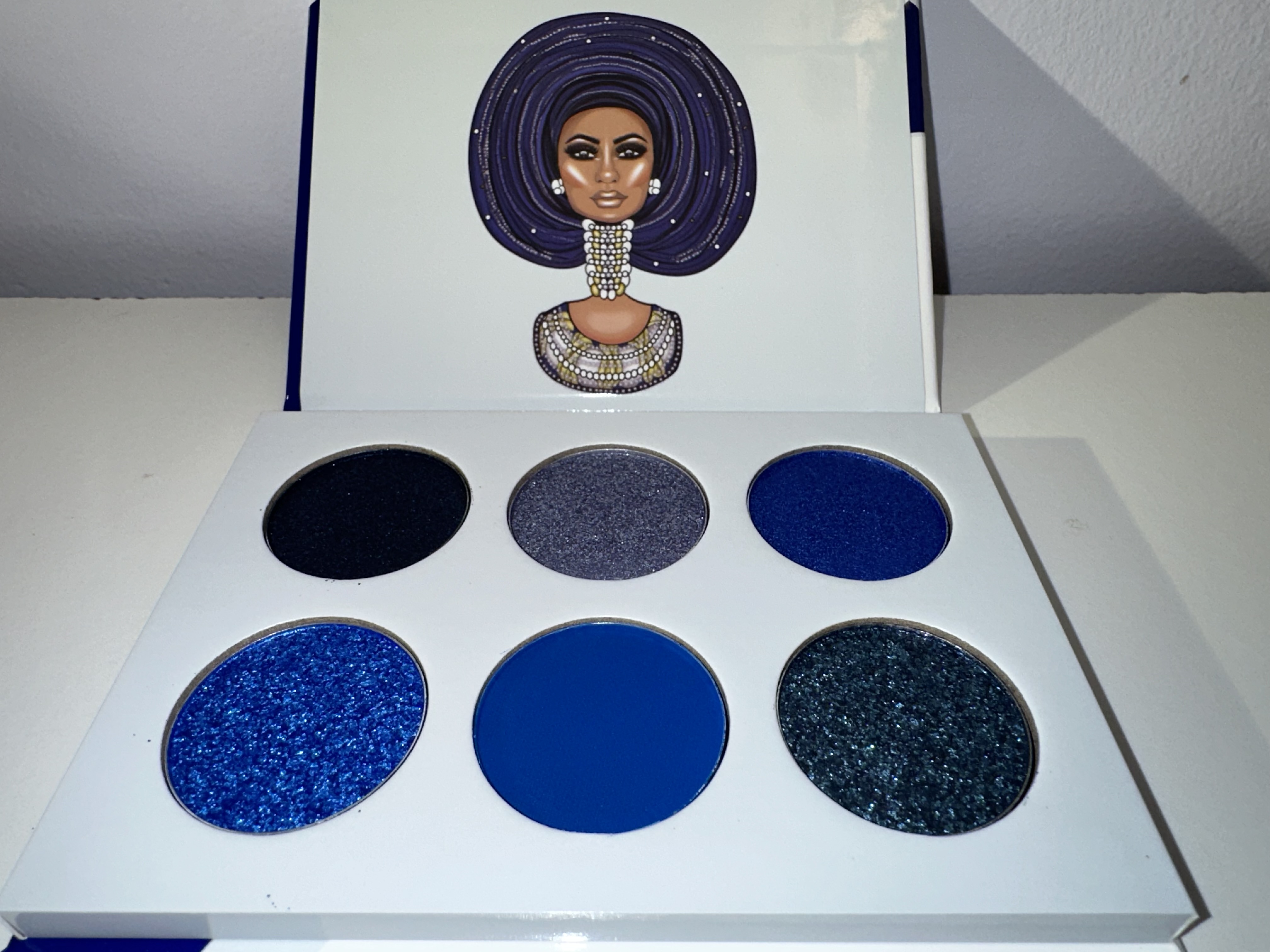 The blue’s here are more on the cool side , with really only one matte , two shimmer/metallic, a few satins and one pearl. I really love the two on the bottom row, If you go on the Ulta website the right bottom is Blue Zodiac and bottom left is Bermuda Grey. Also on Juvia’s website it’s titled the Olori 2 Blue Heaven . So kind of cool for those interested , I do wish they had labeled the shades as it’s nice to see thier names.
Row 1 is Ebony Clay, Trout, Downriver
Row 2 is Blue Zodiac , Deep Koamaru, Bermuda Grey.
 I held the palette at an angle to show off the shimmers and so you can really see the textures of the colors. I love Bermuda Grey shimmer as it’s got a bit of scifi/futuristic look to it,while the others look like they would be great for holidays , going out dancing , or even just nice evening makeup. The Ebony Clay is almost black but still has a hint of blue with the blue shimmers too. The more glittery shades do have a bit of fallout and that can sort of be corrected by using a sticky base , or glitter glue.
 Ebony Clay looks really dark but still has some glitter, Trout is iridescent and looks more silvery with not a lot of blue showing . Also Bermuda Grey has black base but reflects really well.
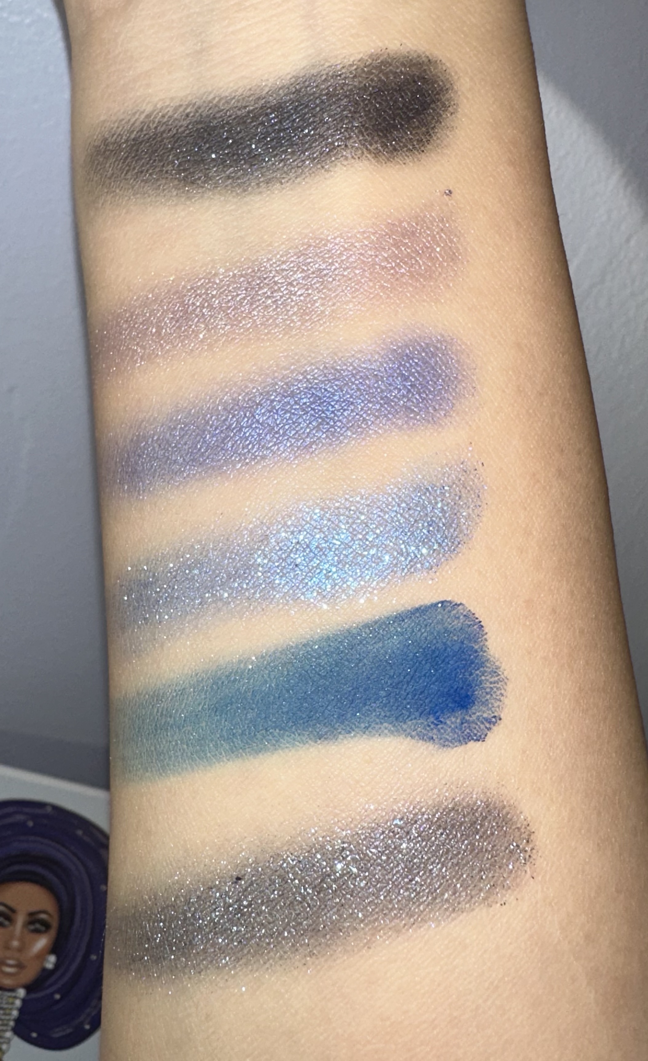 Up close you can see Blue Zodiac and Downriver better .
And now for the looks :
Here’s sort of an icy look I used for my la Roche Posay review. I did use three other palettes with the main colors being all Olori 2.
 I started with Nyx jumbo liner in milk as my base , using the pastel lavender shade
L-O-V-E from the Beauty Bay Retro Love I blended Berry Mousse from the Juvia’s Place The Douce . This kind of made my lighter pastel blue shade, Eycing (from the Glamlite Glam Donut a bit more greenish in tone though.
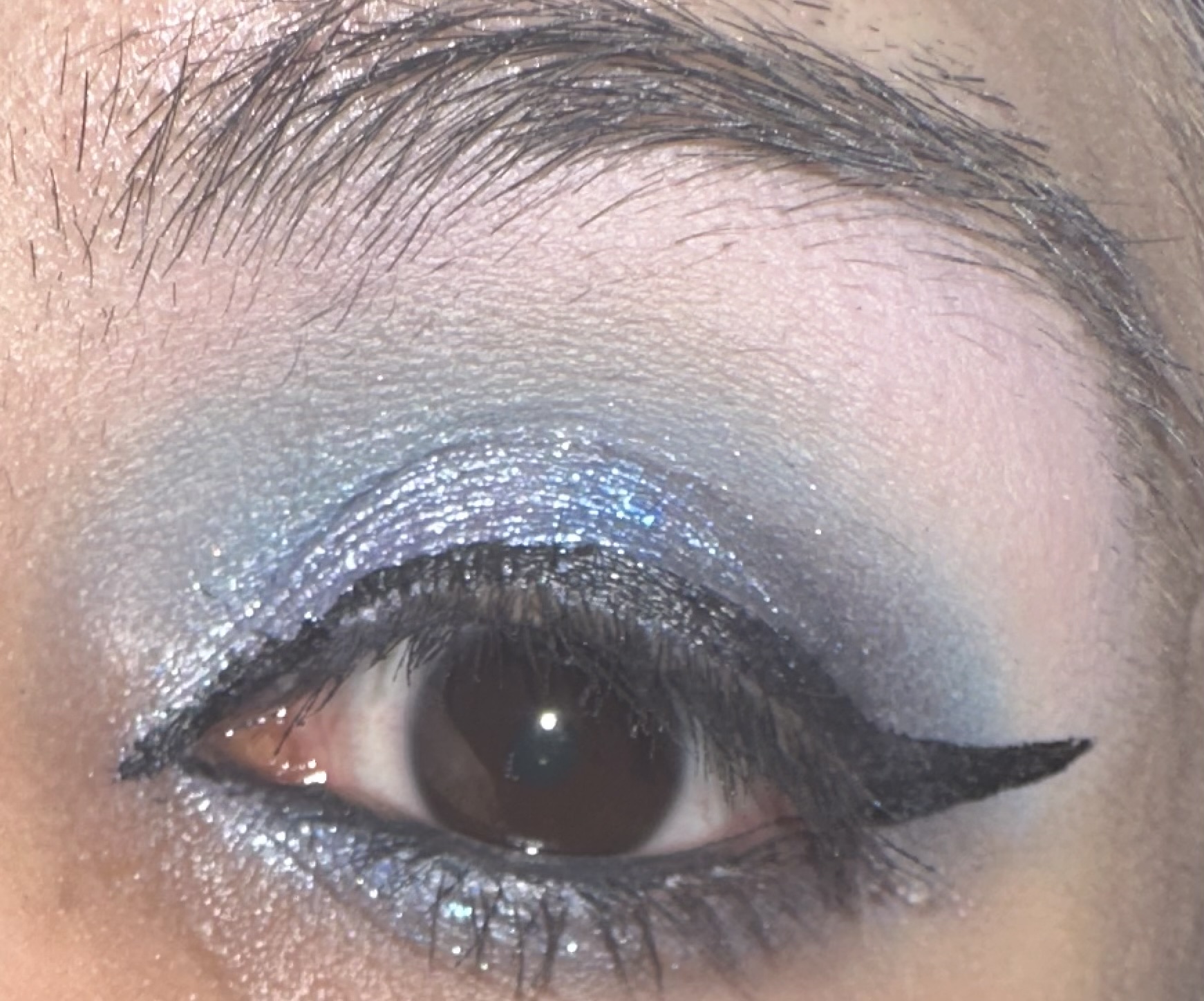
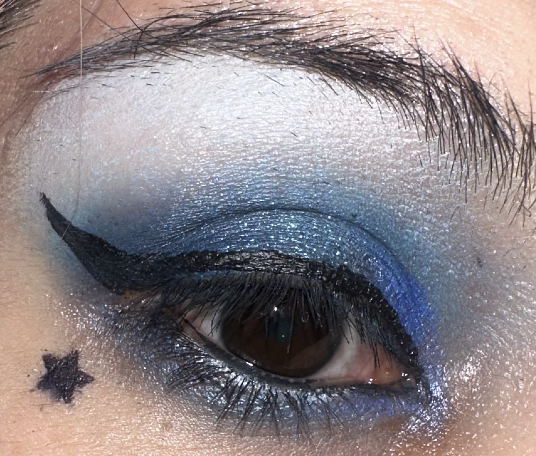
 For the actual Olori 2 shadows , I used Ebony Clay , Bermuda Grey on the V and lower lash, Zodiac Blue and Trout in the middel part of my eyes.
 I really liked this smokey, icy look. I did have some issues with creasing , but I sprayed my eyes with some setting spray after re-applying my shadows and it kept it in place a little better. I do think these shadows are a little more fussy than some of JP’s previous formulas , I’m not really sure why . But if you want to get the best out of the colors use primers, glitter glue and setting spray.
Next is another Graphic liner look . I used Nyx Jumbo pencils , so that’s why the lines are thicker than if I had used a brush. I do need to invest in a tinier brush and some water activated liners though for a sharper look . I also decided to add some liquid liner in a pastel blue shade by Lime Crime as an accent.
 And yes the fallout from the shimmer shadows is shown in the pictures. I did try to clean up a bit with a tinier brush, but the glitter kind of just did it’s thing. I used Bermuda grey on top of mint colored pencil , and Blue Zodiac over a purple liner. On the very bottom , I swiped Ebony Clay which looks more shimmery here, it might be the purple liner underneath giving it a bit more dimension.
 Here you can kind of see my mistakes with thicker liner. I still like the way this looks though. The colors are really pretty and reflect the light well.

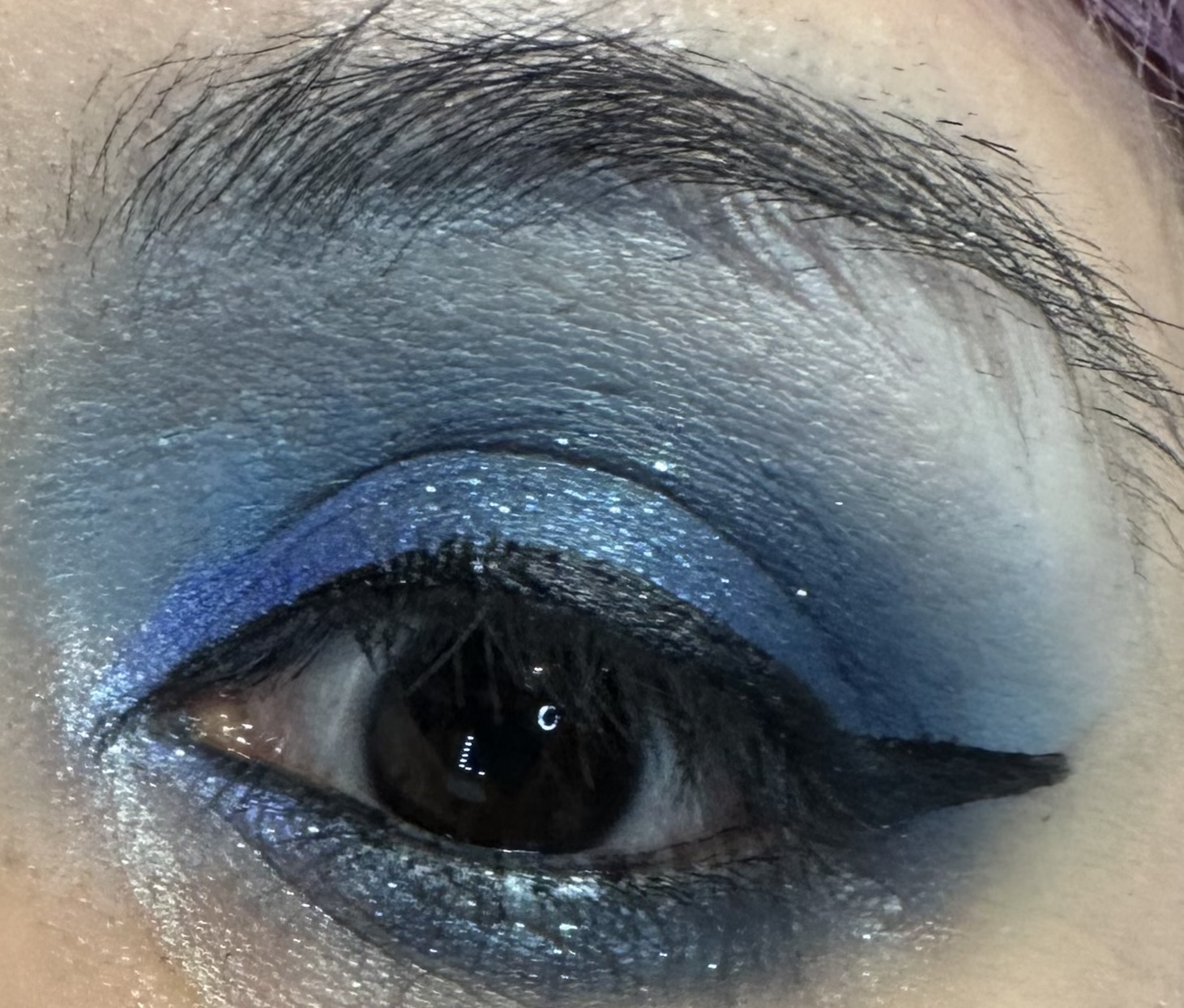
And time for the final Olori 2 look ! This time I decided to embrace the blue and wanted to see how light I could blend out the matte blue, Deep Koamaru. I prepped the area with Nyx jumbo pencil in Milk, used a bit of Eycing from the Glamlite Donut palette in my crease . I tried to do a barely there coverage , and later I applied the matte blue from Olori 2 in my crease and V. Later with a fluffy brush I blended it out, and I decided to blend out all the way to my brow bone. This is a bit controversial as many are scared to use blue that far up. But I really wanted to see how pale this blue would blend out as it’s sort of deep colbolt in the pan and in my V.
 I’m also using different flash settings too. Here the blue appears more white and you can see some of the other colors I used like Bermuda Grey, Ebony Clay layered on top of the matte blue , Downriver used on sort of the middle to inner corner which I blended into Trout.
 Here it is without the flash but I still have some good lighting. The pale blue is more noticable on my brow bone, and Bermuda Clay is super shimmery here on my top lids along with Trout on the inner corner. Downriver works more like a satin , it does have some nice light reflection but isn’t as much of a statement as some of the shades in the palette.
 Also I did have to spray my eyes with setting spray as some of the shadows start to crease a bit. I’m not sure why this formula is a bit more finicky than Juvia’s other shadows , but I did try to keep that in mind when using these shadows. They need a good primer , a glitter glue for some of the more glittery shades, and a setting spray to keep things in place. And while I’m on the subject about the Ebony Clay, Bermuda Grey and Blue Zodiac , these shades can be messy and flake off when you are dipping your brush in the pans. My palette had little flakes of blue and glitter from these three, which I had rto wipe off with a damp tissue. Some of the shimmers in the Sweet Pink are kind of like that too, but not this bad as the Olori 2.
 I really do like this palette in spite of some of the issues , but I do think I need to use other lighter blue palettes or other shades from my large collection to get the most out of it . I didn’t take a picture , but one of the prettiest looks , was with some of the lighter blue shimmers from the Beauty Bay Retro Glam . I may have to recreate that sometime.
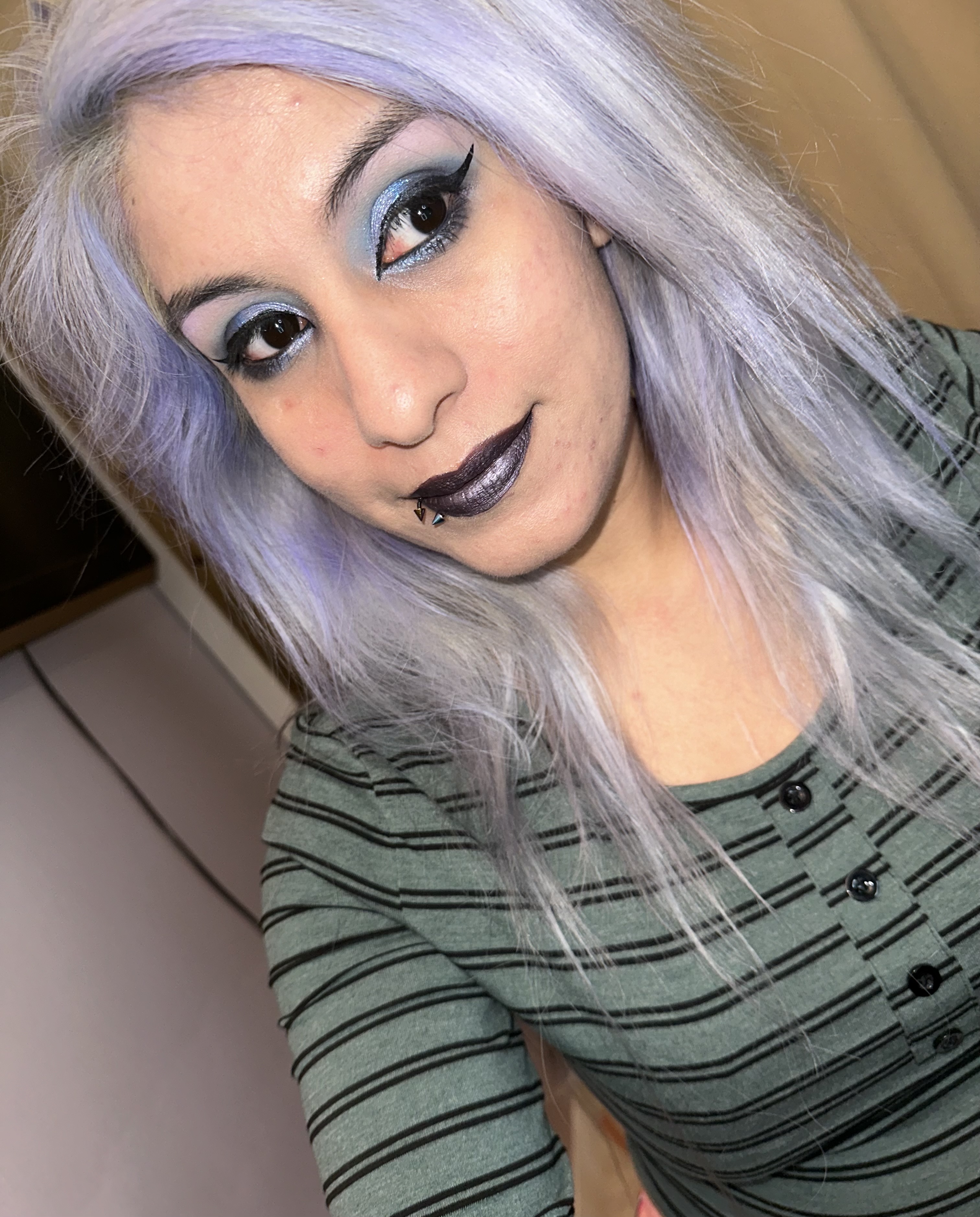
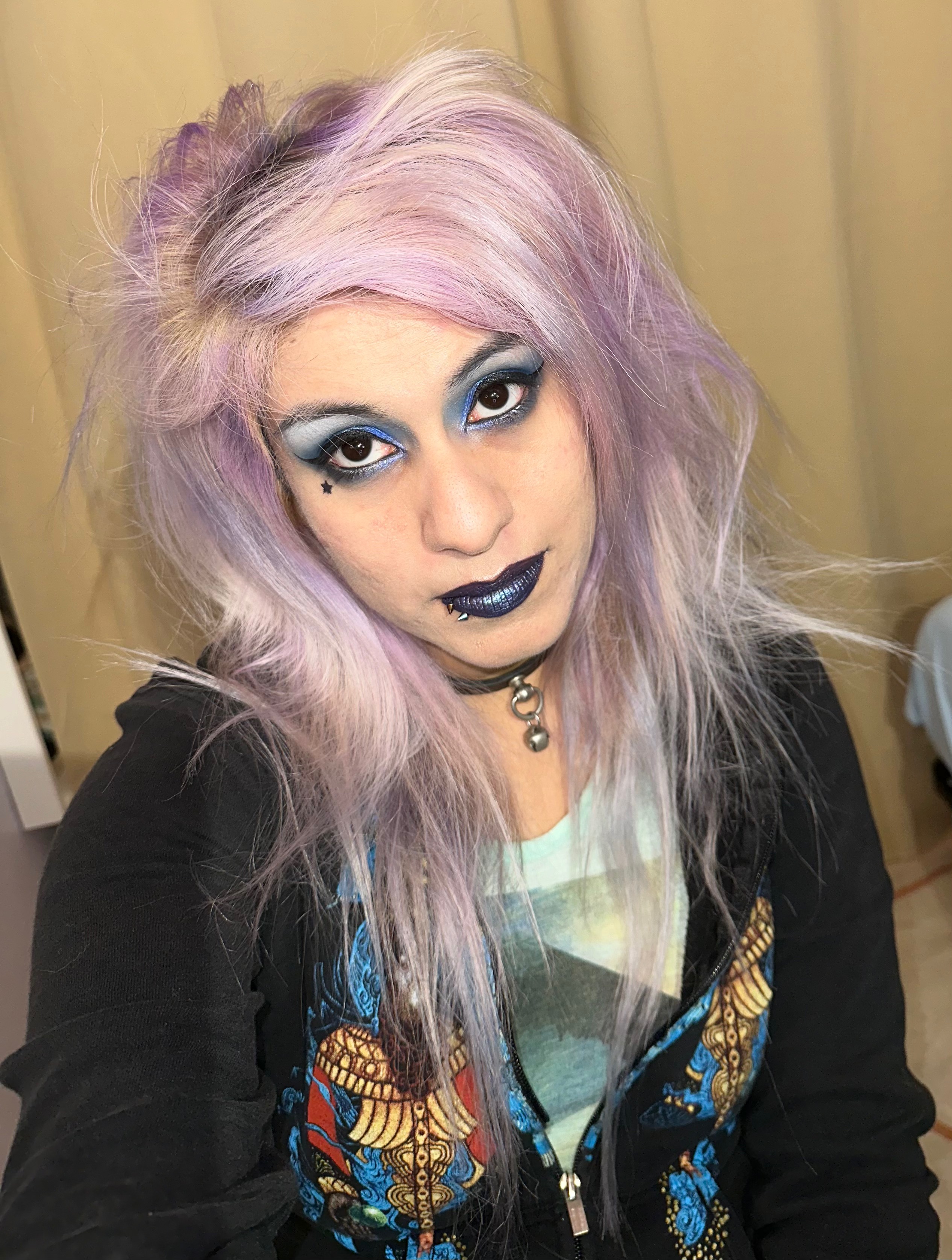
 I decided to pair my eyes with a blue iris lipstick and metallic lip topper from Too Faced. I’ll be really sad when my metallic toppers run out as only two of them , one being the Too Faced melted matte talic which has been discontinued and my Black Unicorn Diamond Crusher’s from Lime Crime.
 Overall I really liked this palette , and while it could intimidate others with it’s solid blue color story , there’s enough variety to make some interesting looks. Of course it’s best a nice supplemental palette for other colors stories . And I reccomend having a few icy pastels to blend into the darker shades as well. Plus I think a lot of these shades would flatter deeper skin tones as well. Well let me know what you think and if you have this palette or any other Olori mini palettes . Which one was your favorite. Have a great week !
Also I wanted to show off all three palettes as well.


Not a blue fan on myself, but these look fabulous on you x
LikeLiked by 1 person
Thanks so much ! You’re too kind 😊
LikeLiked by 1 person