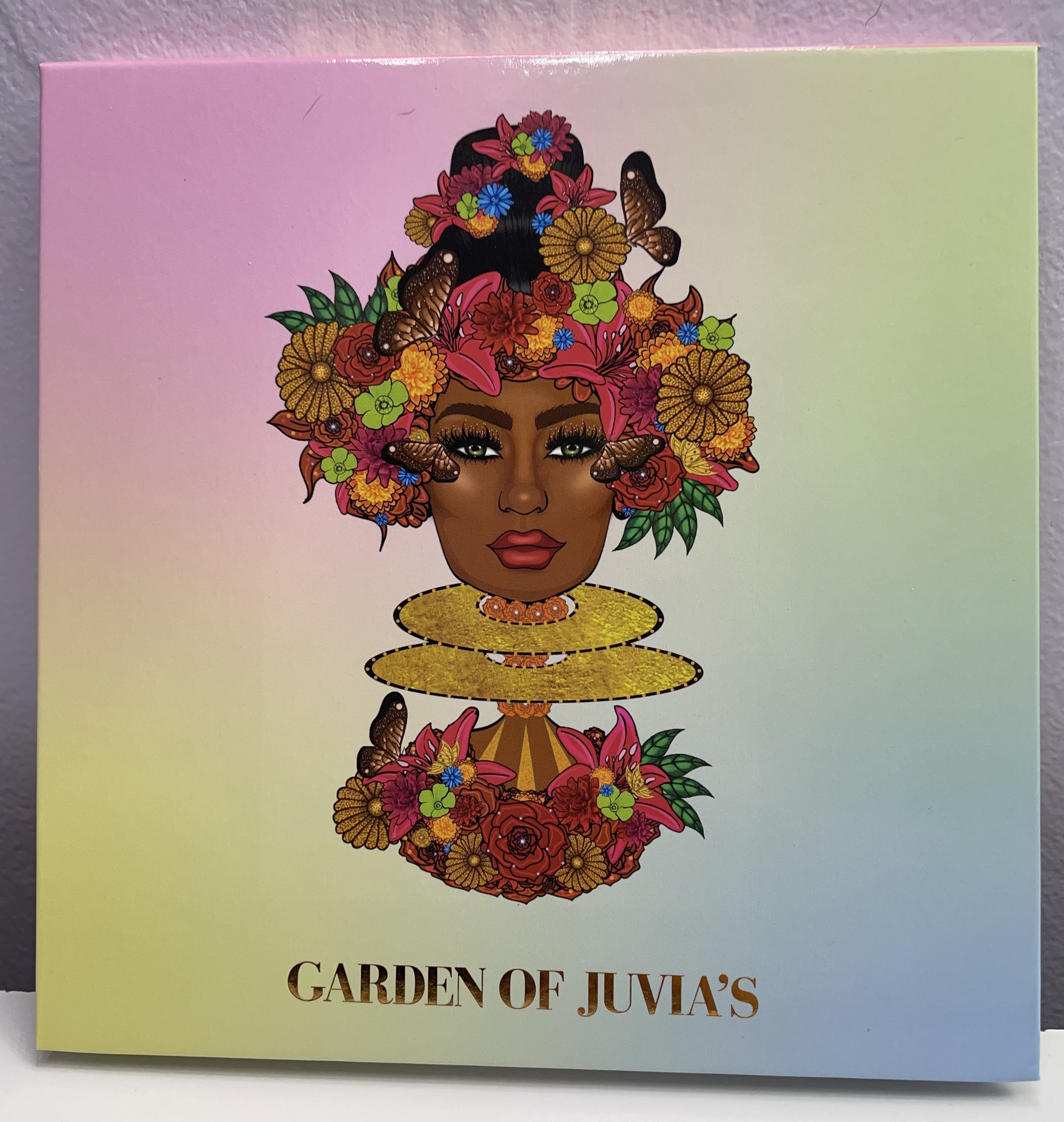
 As promised ! I have finally finished the Garden of Juvia’s review ! It took me a while but I really love this new palette . When I saw it, I was taken a back by how spring like it is especially with the pastels shades . But I really loved the shimmers and how easy it is to create looks , It may even replace the Fun Size and Donut palette as my favorite go to pastel palette.
So let’s check out the colors and finishes .
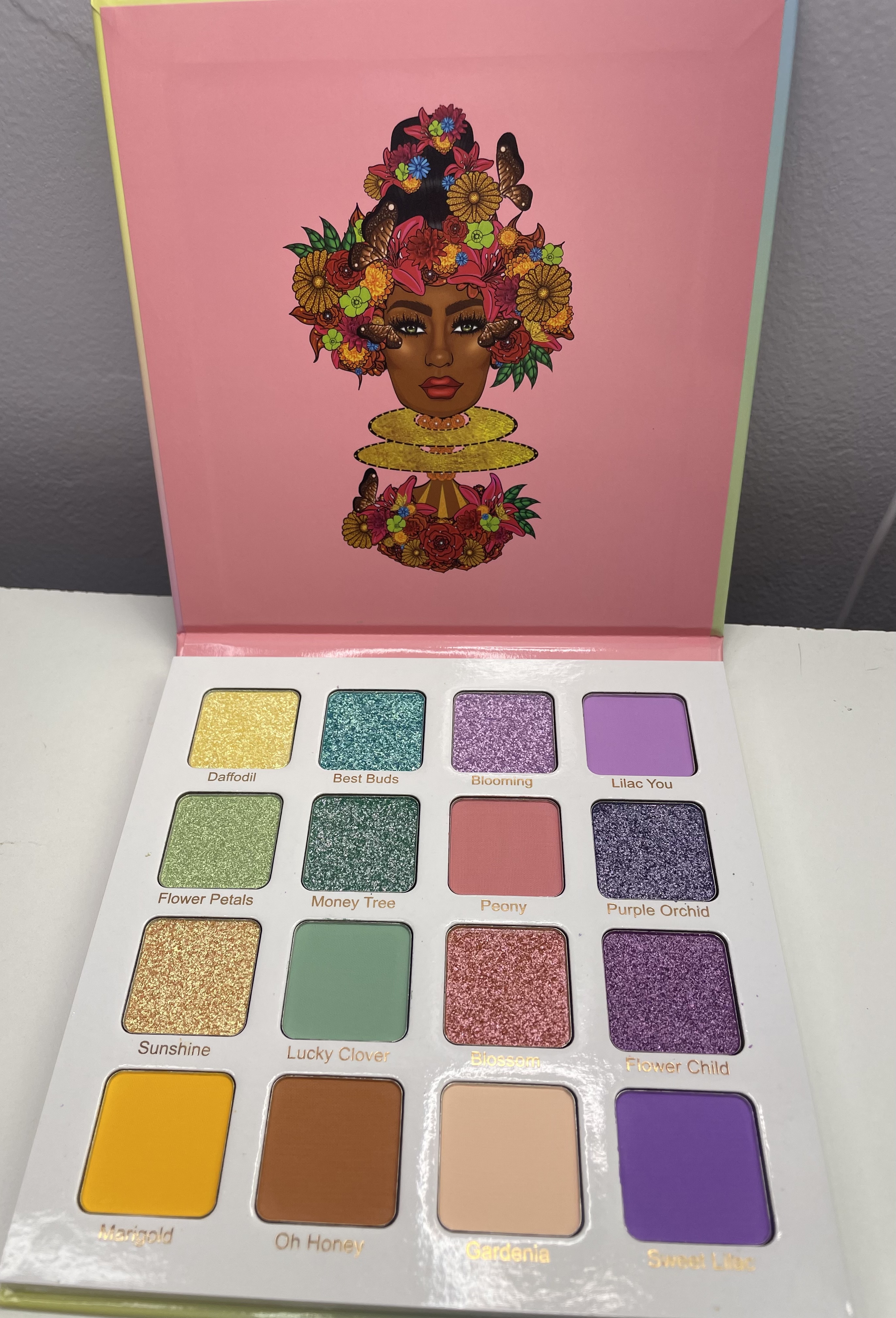 It’s definitely a very springy color story, with the yellows and what looks like a green in pan, Second is the blue/teal row with a mint shade and sandy tan neutral. Next is the purple shimmer and pink row , along with a cream and last is the purples and lilacs.
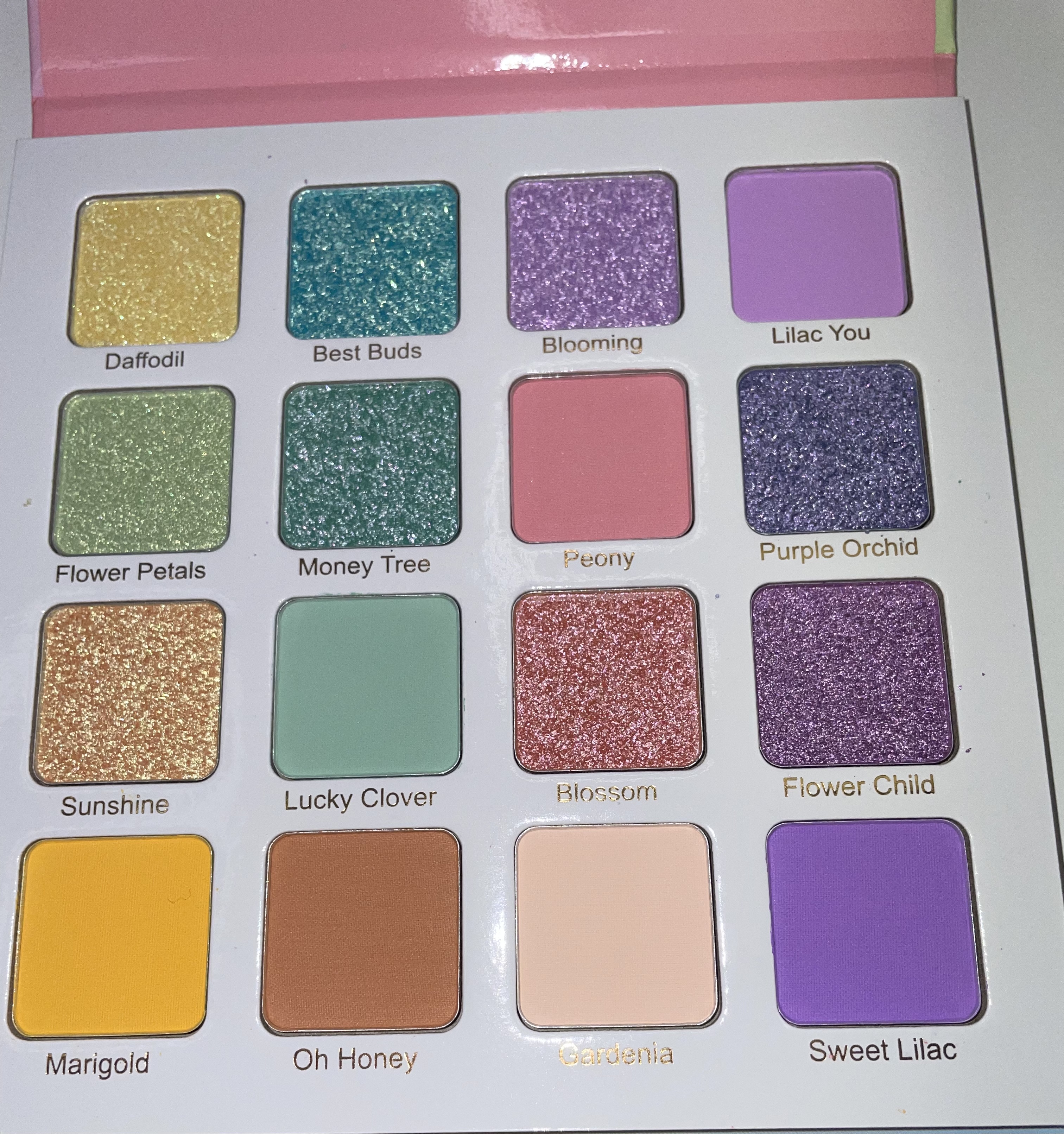 Upclose look at the pans . I really love how glittery the shimmers are.
And now for the swatches!
for the first two rows I wanted to do two pictures to show off the duochromes . The yellow, green and gold do kind of look similar but Sunshine reads more sunny gold with a warm shift , where Daffodill has yellow and white gold shift, and Flower Petals has green with gold shift. It reminds me alot of a Too Faced shimmer that I love from Life’s a Festival. So if I ever hit pan it’ll be nice to have a back up. Also Marigold is a bit chalky but still workable. Same with Oh Honey.
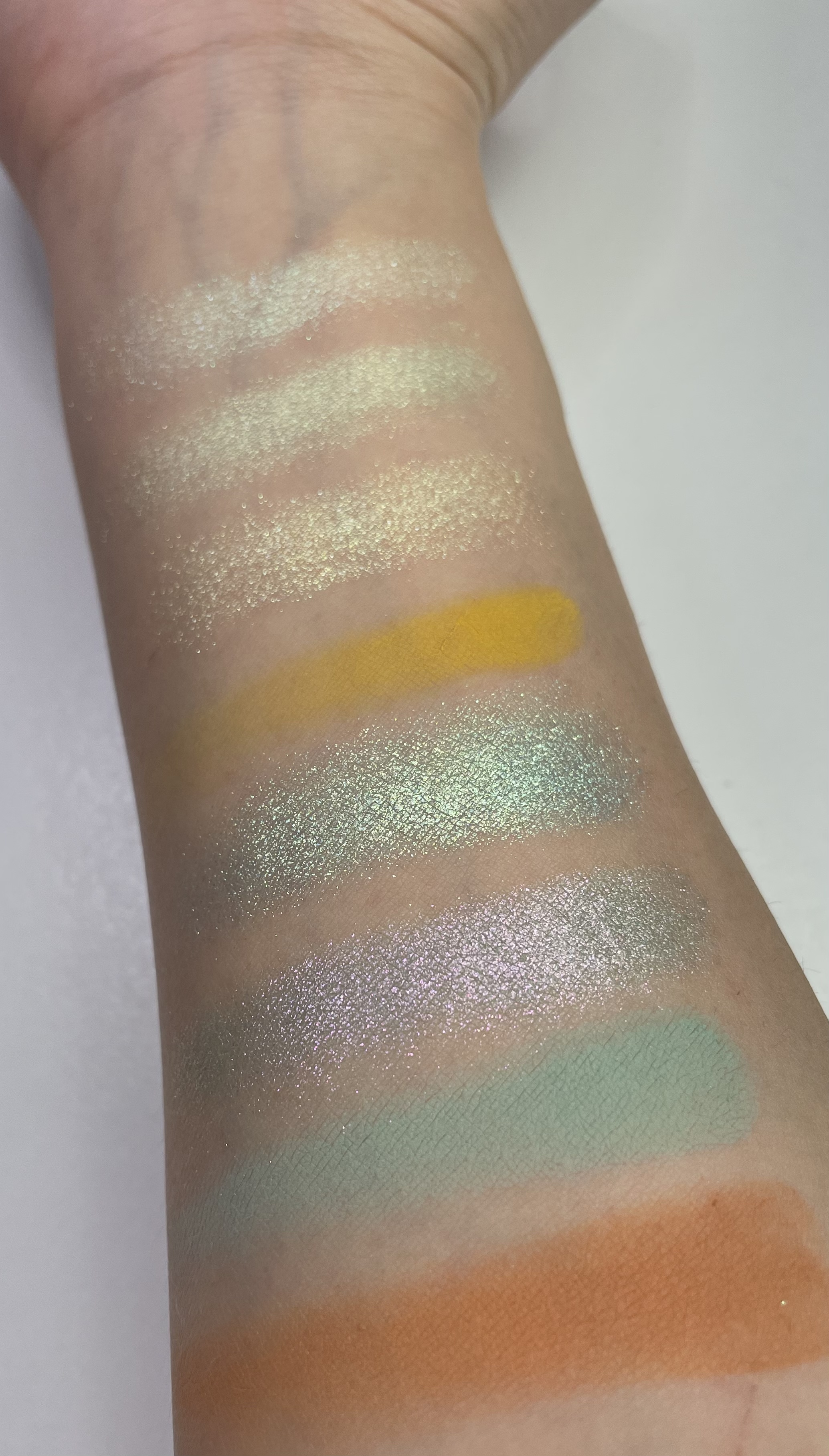 Best Buds has a teal blue base with a gold shift you can see the gold more in this picture and the light pink shift in Money Tree.
 In direct light these shimmers take on a wonderful wet look ! Also Lucky Clover worked better on the eyes witha white base.
 Upclose view of the two blue shades .
Now on to the next two rows.
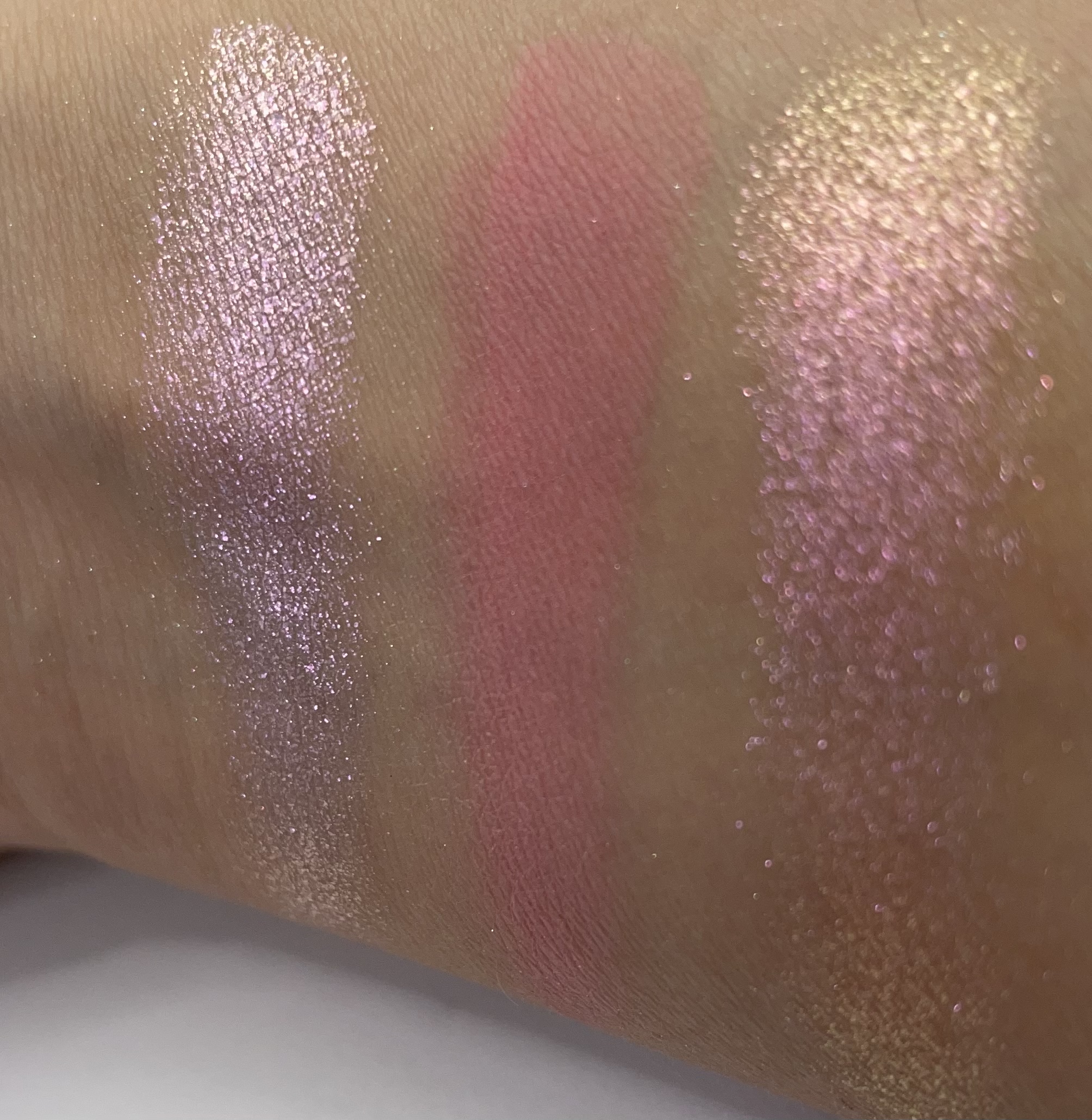
 Blooming is such an interesting color as it looks a bit purple in the pan but is way more pink on the swatch. Blossom is a very close dupe to Umbrella Drinks from Too Faced’s Papaya Pop palette and the purple duochromes shift are very nice and subtle here.
I thought a video would capture the shifts a little better for these shades.
 Blooming and Blossom up close . I love Blossom’s pink to orangy gold shift.
 And the candy sugar purples ! Purple Orchid is pretty much holographic.
And now for the looks. I reccomend white base , or soemthing tacky like a primer or glitter glue to get the best out of all the shades.
Pastel Universe!
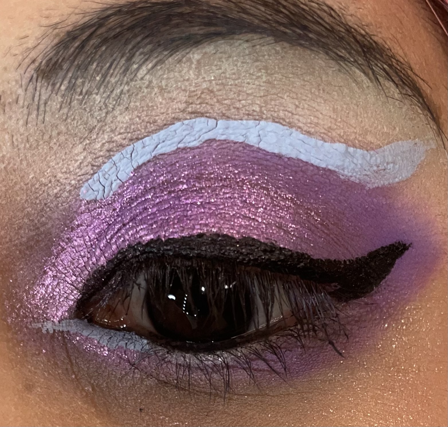
 My first look from the sneak peek . I used multiple shades . starting from the purples side I used Sweet Lilac, Flower Child, Blooming, Blossom, Money Tree , Flower Petals , Daffodil and a bit of Sunshine. The brow bone was a mix of Gardenia and Oh Honey. Both shades are bit chalky but workable .
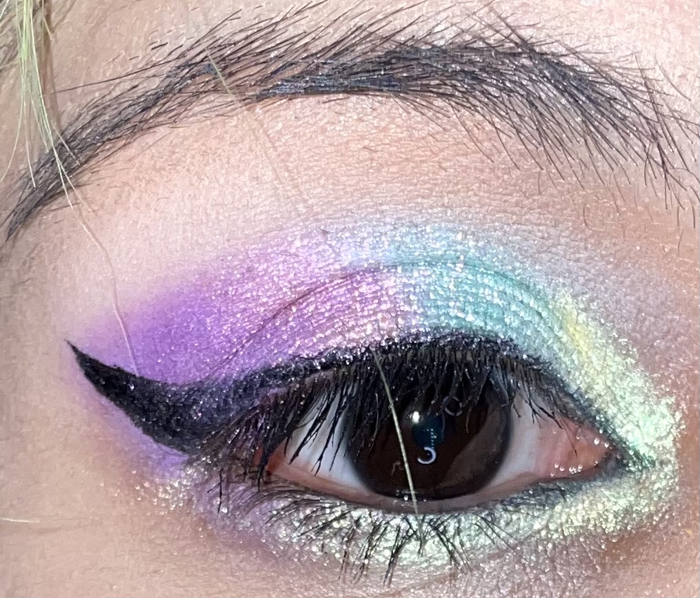 In direct light!

Strawberry sunset:
 I’ve noticed that sometimes to make pastels really stand out you can do some graphic liners . This look I was pretty happy with and the mattes blended nicely together. I used Gardenia, Peony , Marigold and a bit of Honey. Oh Honey can be a bit difficult to work with , I would normally just swap it out but for the purpose of the review I kept it in the look. The shimmer I used was Flower petals . It looks more yellow here but in different lighting:
 It’s a bit more greenish.It kind of glows here tbh.


Lilac Dew look from my Lime Crime Dew Drop review :
 Gardenia was blended with Lucky Clover , Sweet Lilac and Flower Child was ued alongside Blooming in the inner corner .Again I was experimenting with liquid liners and graphic looks to spice up the pastels . I think it’s a nice contrast and I’ve seen a few promo pictures on Juvia’s Place IG page with this palette and colorful graphic liners combined.
 Also for this look I used one the gold shades as a highligher but I’m not quite sure which shade it was.
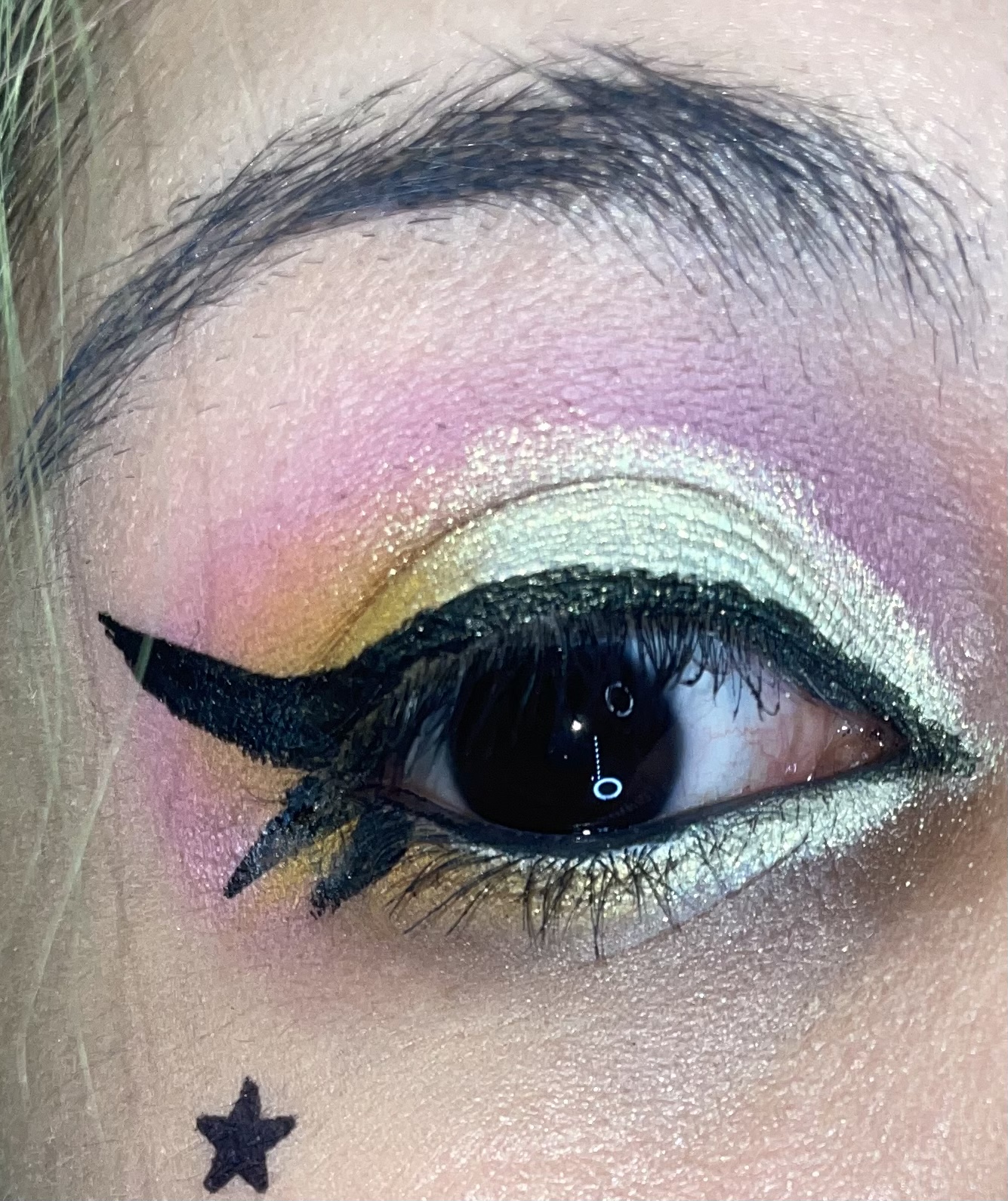
Graphic Butterfly!
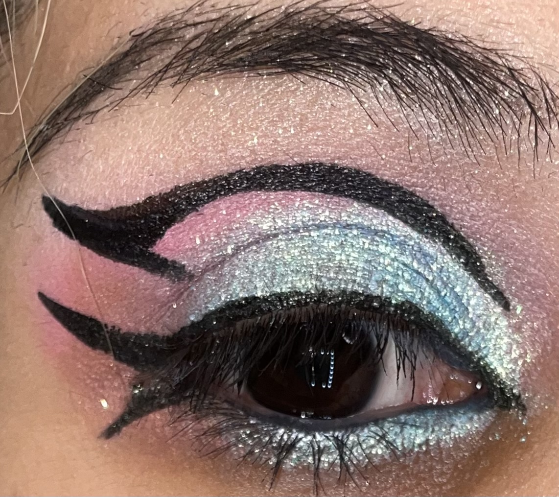 This combo I was interested in how it would look I used Peony , Oh Honey to darken the bottom a bit, and Best Buds shade and a bit of daffodil to brighten up my inner corner. Gardenia and Sunshine were use on my brow bone.
I’ll add extra pictures of this look to sho off shift and contrast.
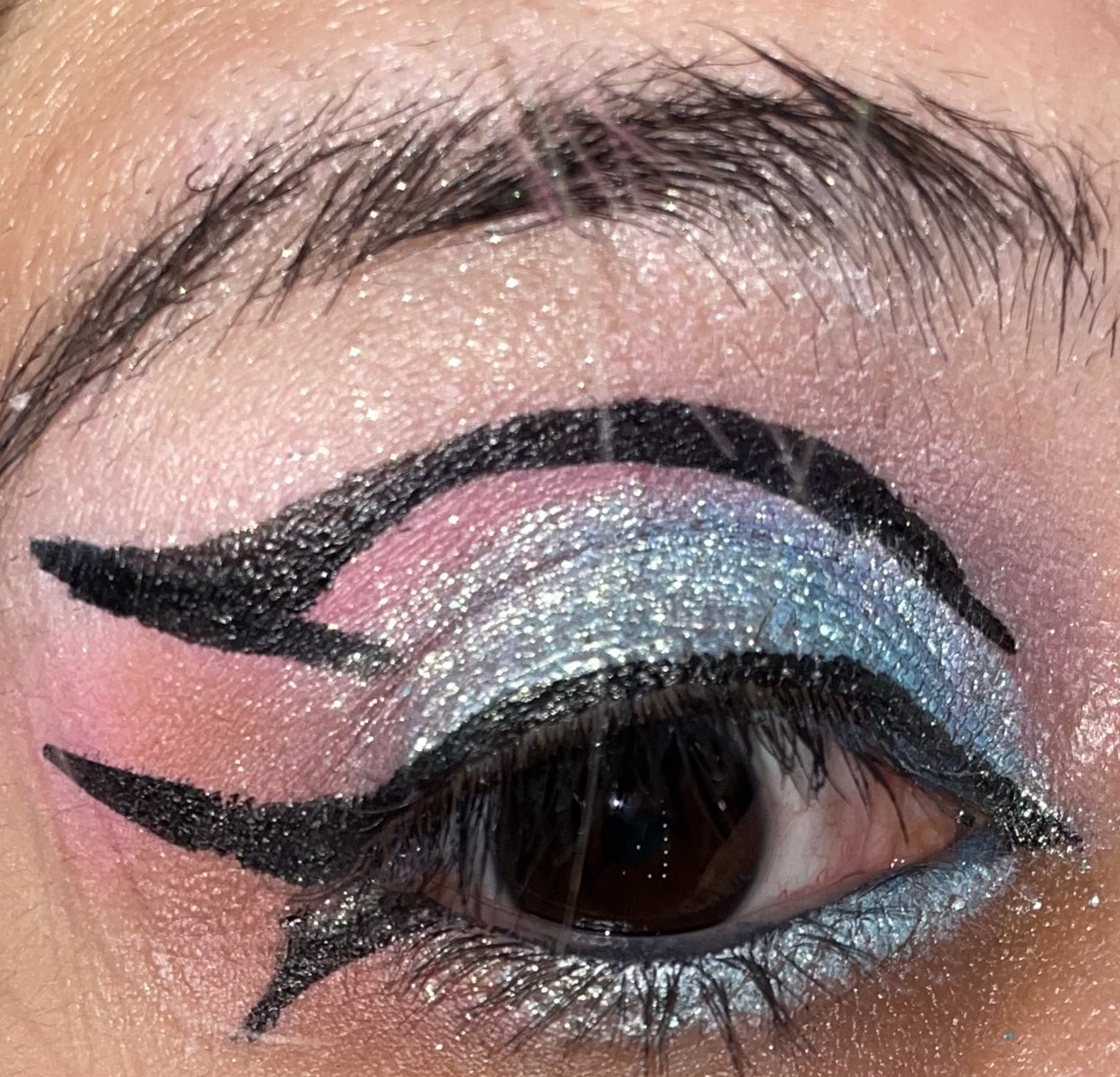

 It looks a bit more silvery from a distance.
And now that I’m to my last look I forgot to photograph the Purple Orchid look , But I’ll have to add it to a seperate post. Here’s my Coralized look instead.
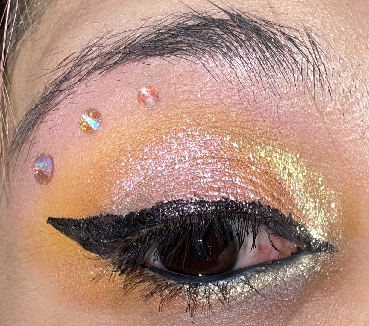
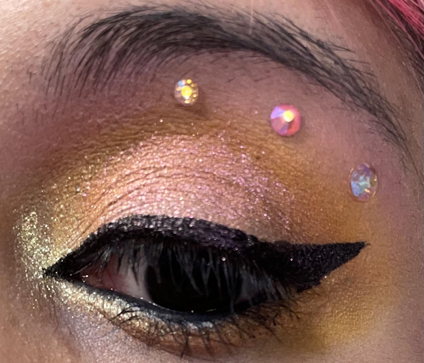 No more graphic liner , instead I decided to play around with crystals . I used Peony on my brow bone and blended gardenia so it wouldn’t be too bright , as well as blending Marigold and Oh Honey together. For the shimmers I used Blossom and Sunshine.
 Overall I really liked this palette, the shimmers are amazing and the pastels are nice . Some are obviously better than others and I think the pink, purple and lilac shades were more pigmented with the orange, and mint shade being lighter and needing a white base with a stiffer pigment brush. Oh Honey was not that great in my opinion and I will probably use one of the other neutrals from my other JP palettes or a Too Faced shade. I do think some may still need a darker shade or brighter matte shades to add contrast and probably get more use out of the palette . But the shimmers alone I think make up for it. Well let me know what you think of the palette and if it’s something you would be interested in picking up. Have a great week everyone !

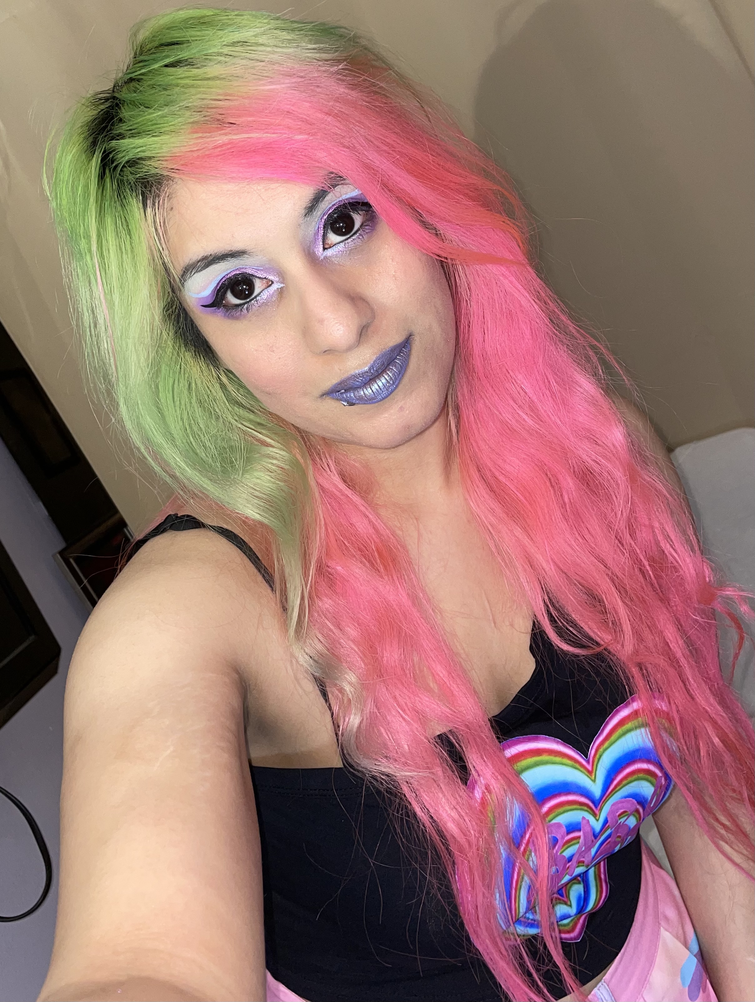
I love all the looks you came up with and I love your hair!
LikeLiked by 1 person
Thanks so much ✨💕
LikeLiked by 1 person
You’re welcome 😊
LikeLike