*This post contains affiliate links
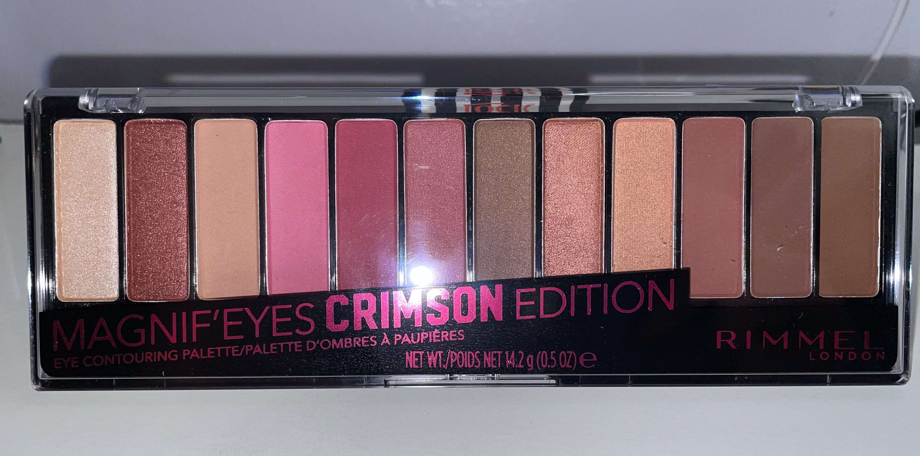
It’s been a while since I’ve tested out a drugstore palette. I think the last one I did was Wet n Wild’s Pac-Man palette which was kind of a mixed bag. But my fiancé found this Rimmel palette for me to try , he thought the color story was pretty interesting. And you know what it totally is ! It’s like a nice dupe of Urban Decay’s Naked Cherry palette. I always was curious about Naked Cherry, I liked the color story but wasn’t sure if I should invest in that many reddish pink shades. So this well be a nice way to see how I like that color story for less.
 The Naked Cherry for reference
 The end chocolate shades could be a bit darker, but same vibes as Cherry.
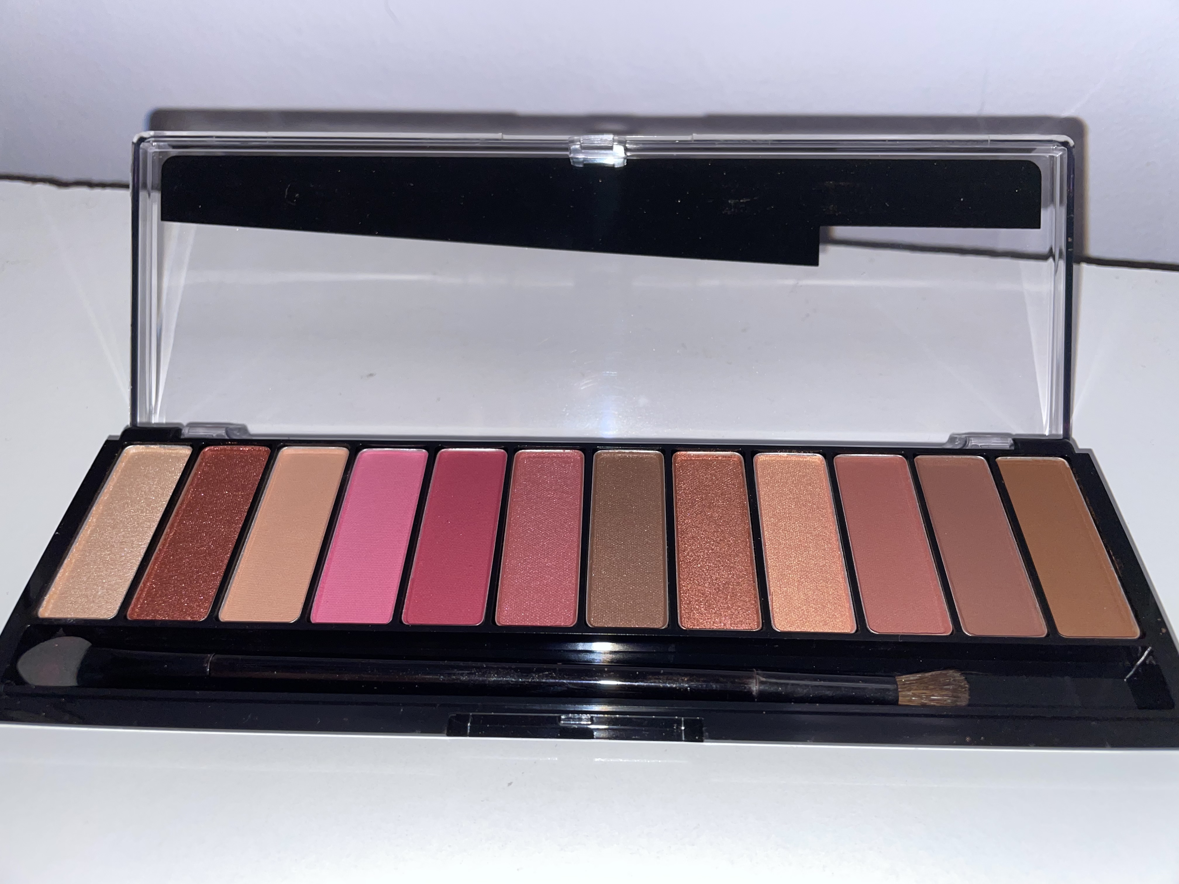
 Here you can see the brush and sponge . I only used the sponge as a last resort. I’ll explain in more detail.
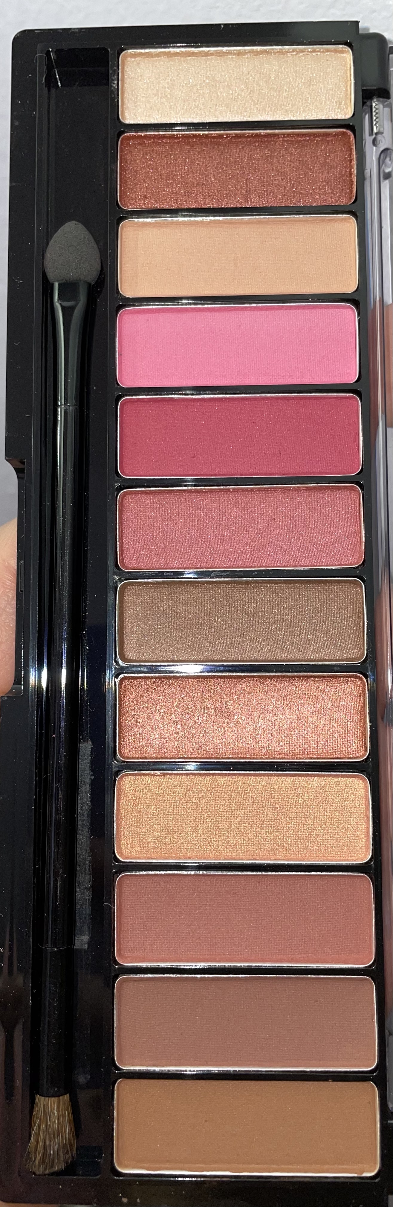
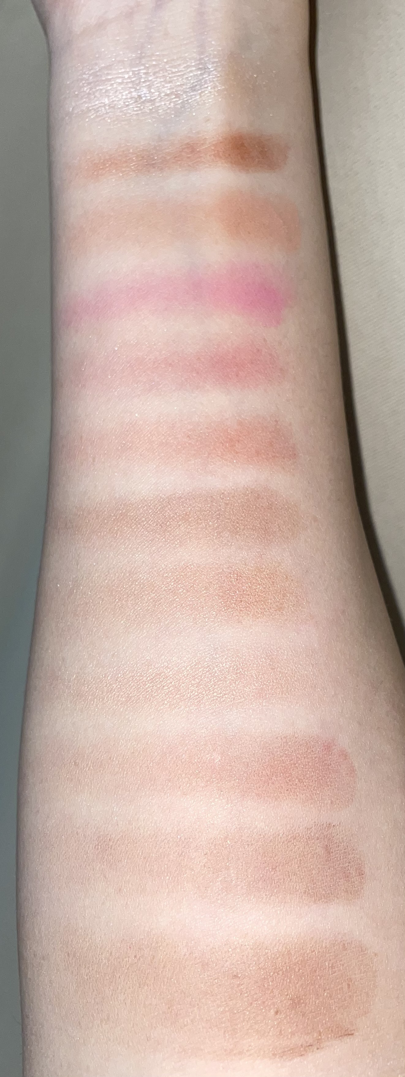 Oh Noes ! These swatches could’ve been better. I tried to go over them a few times . The browns really didn’t want to show up on my skin at all. Plus many of the shades look very similar. Even the shimmers were really hard to swatch.
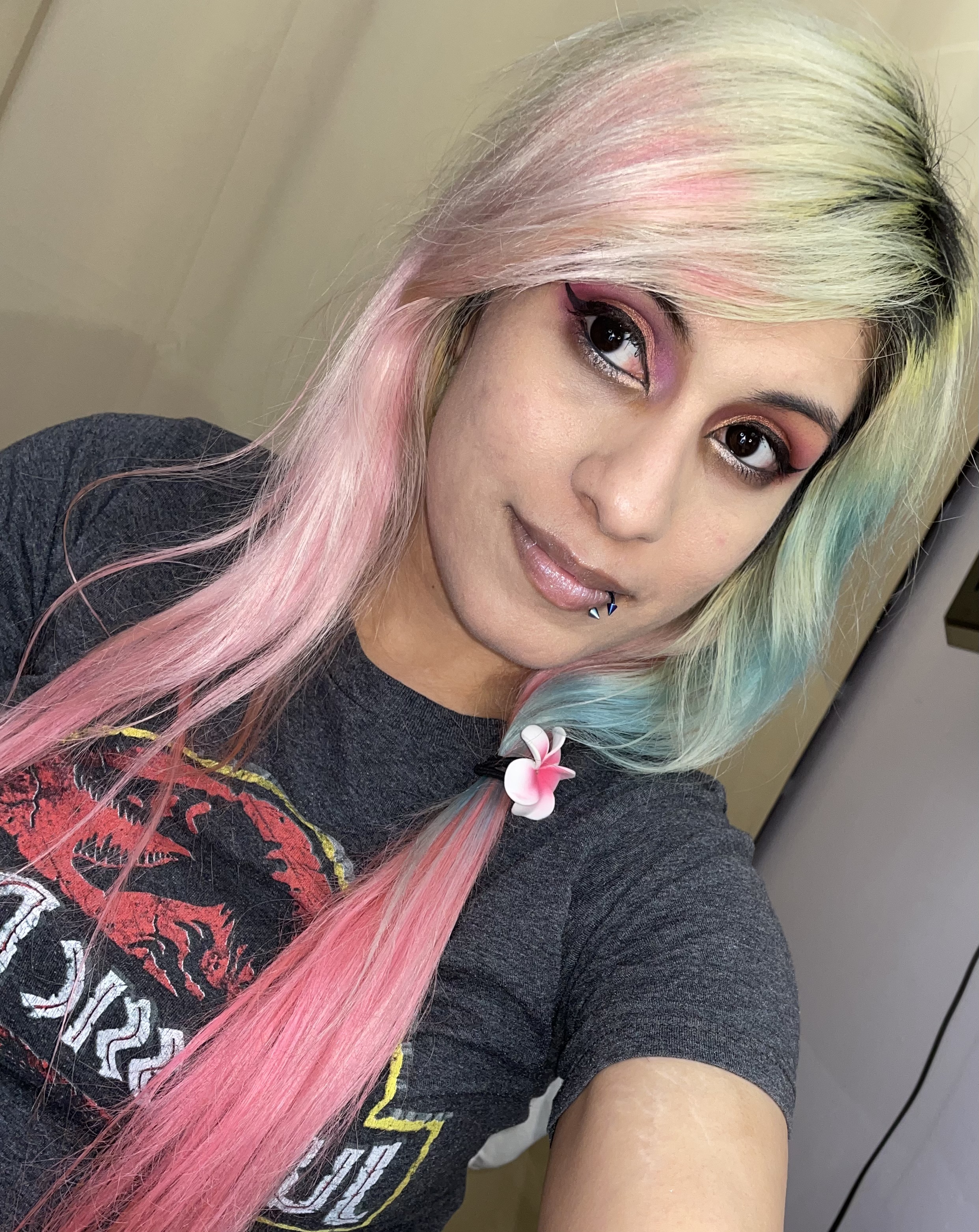
Now for the real test . I used Nyx Jumbo milk pencil on one eye as my base . This really helped differentiate colors and made them pop out a lot more than they would have. My other eye has no base or primer. And it took forever to build to a certain intensity . I used a combo of my brushes and the sponge applicator. Also I had issues getting a product on the Milk side as well. This meant repeatedly having to go over colors and layer. I used multiple shades , all the shimmer shades , the pink, the deeper crimson, and a chocolate shade to deepen the crimson .
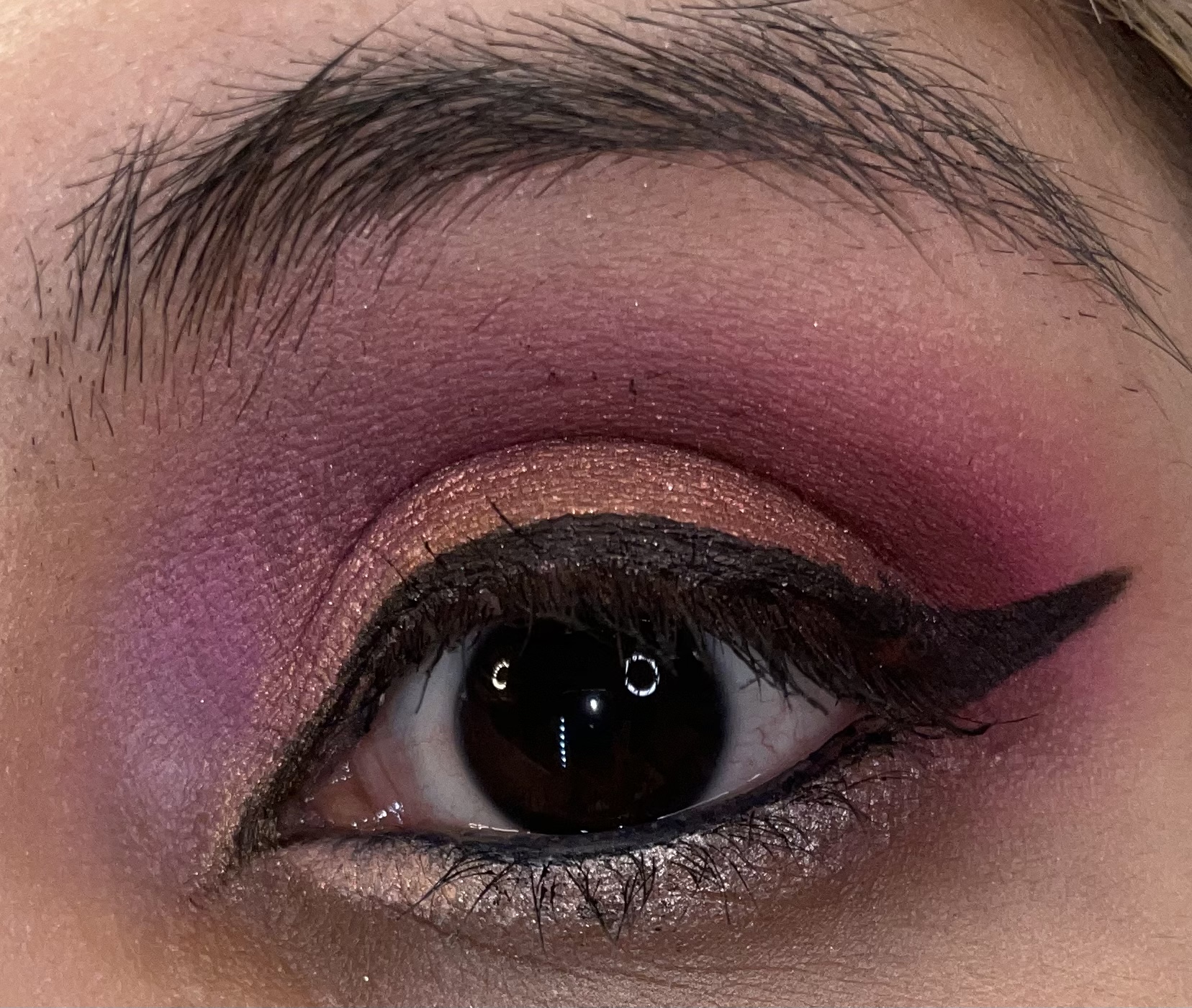 This eye showed more of the pink, and the colors showed very bright. Of course this took a long time to build up. I also had issues with my mascara . But at least it helped mark which eye I used the base on. I do like the color scheme but I really wish the palette was a bit easier to work with.
Now for the No base no primer side.
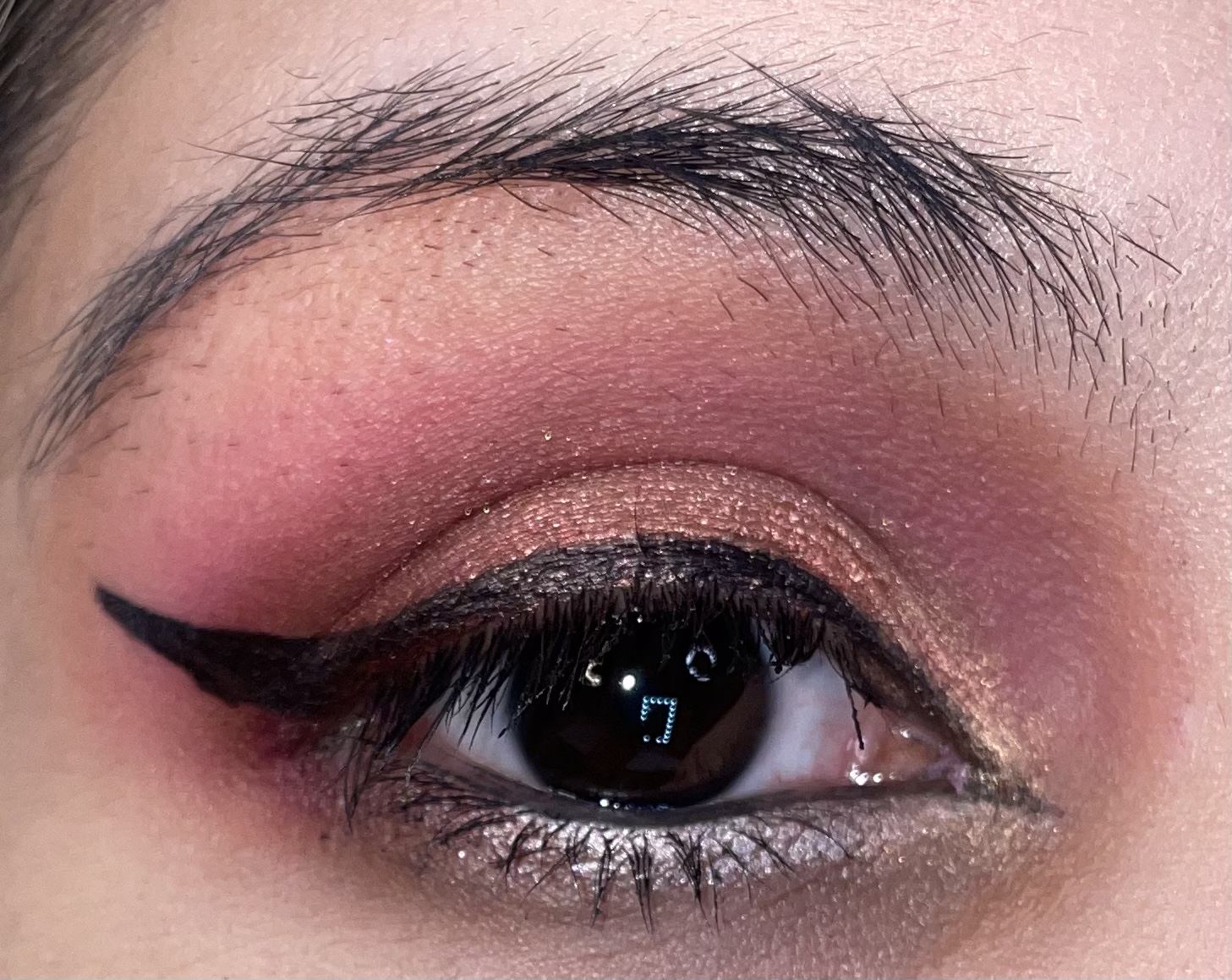 while it looks better with the liner, this side was also less pigmented than the other side. I had to keep filling in areas due to patchiness. Even the shimmer was kind of hard to work with. I used essentially the whole palette save for a few of the brown shades , which kind of look thee same on my skin. The shimmers in my opinion are pretty but are some of the dustiest , hard to apply shimmers in my whole collection. Even using a sponge applicator wasn’t enough. I had to really did my tools in to get the desired pigment and look. Plus some of the shades were a bit harder to blend.
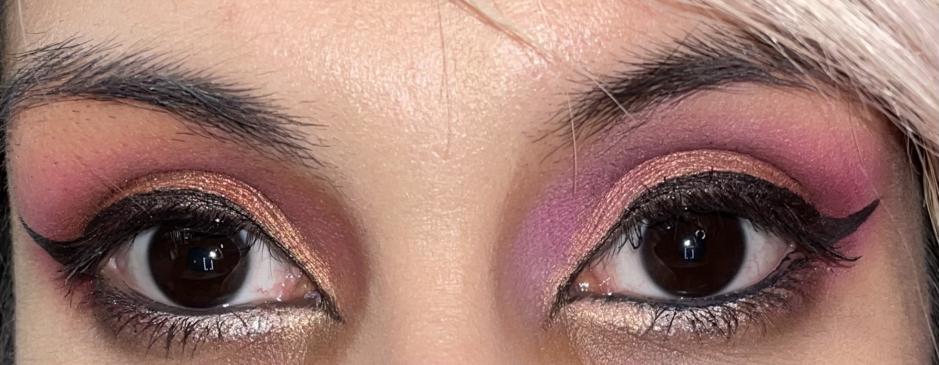 Here you can see both eyes together. The one side looks a bit more pink due to the base used.
 Overall I do like the color story , it’s very pretty. But its also hard to work with and probably one of my least favorite formulas . You definitely have to keep building the pigment up , which I guess some may like, but it does require a bit of patience. I do prefer other formulas that are easier to blend and apply. I don’t think I’ll be reaching for this often due to those issues. Plus a do feel some the colors are very similar on the eyes. I would’ve made one the chocolate colors a bit deeper. The red shade next to the crimson ,on the eyes is also looks about the same as the crimson. The copper and rose copper shades were pretty but took forever to layer even with a base. And the white champagne while beautiful also takes time to use. The peach shade was alright, but I definitely have more buttery versions of it too.
Well let me know in the comments what you think and if you like these cherry crimson color stories. Have a nice week everyone.

First of all, so cute your fiancé thought of you when they saw it! Super pretty palette! Too bad about the formula. Thanks for reviewing, I would’ve totally picked it up if you didn’t talk about the pigmentation 😬
LikeLiked by 1 person
Thanks I’m glad you liked the review. Its too bad as it is a very pretty color story .
LikeLiked by 1 person
The looks you created were beautiful. You for sure made it work.
LikeLiked by 1 person
Thanks so much ✨I do like the color story
LikeLike