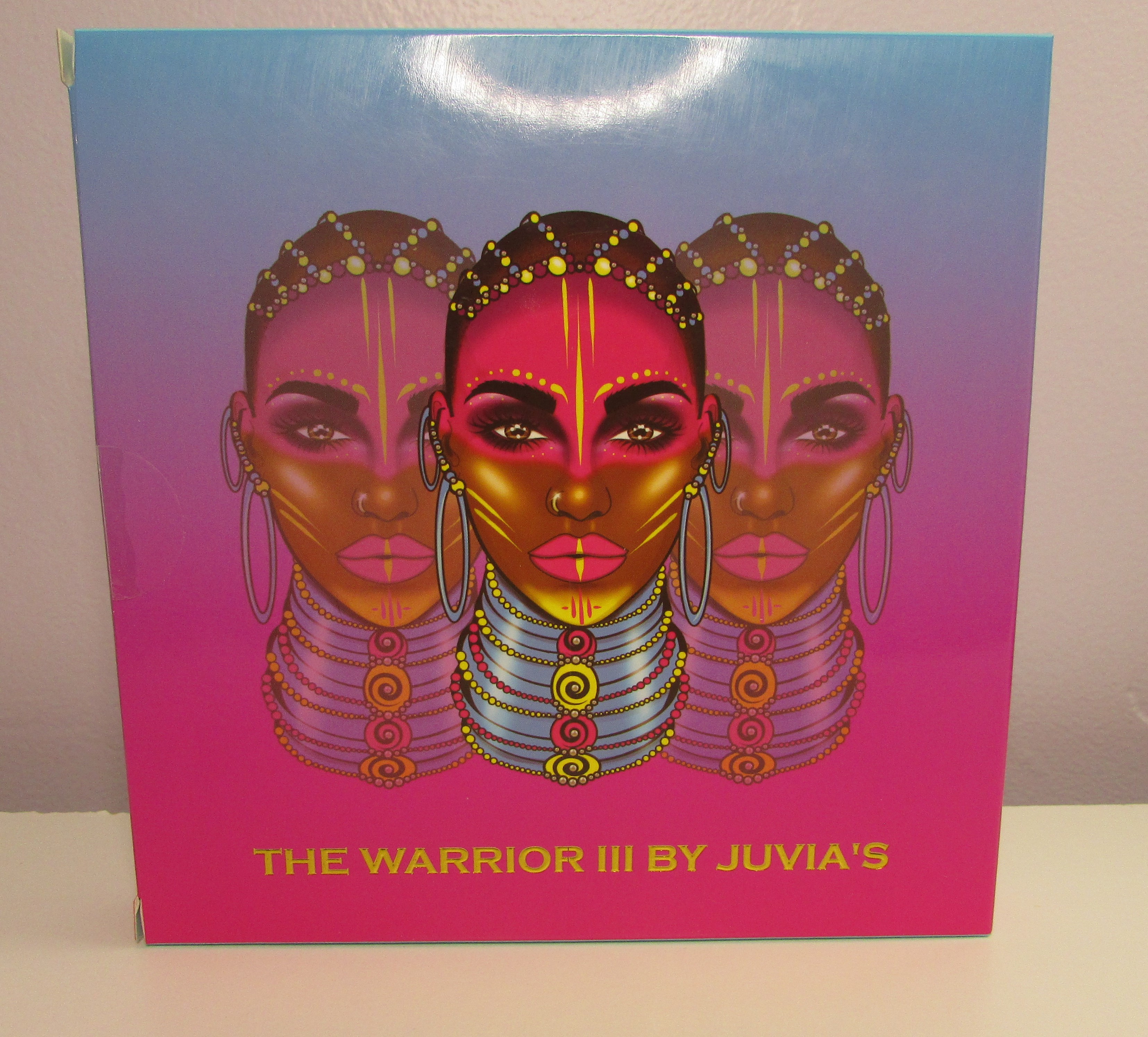
 So I finally decided to try out the Warrior 3 palette, it’s been on my wish list for quite some time. I loved the bright colors , and thought it would match well with The Zulu palette. But for some reason I just never ordered it . Well until now. And wow ! The colors are amazing! My only thing is some of the color combinations through me off, So I decided to look to the natural world to see what color combos would work. And surprisingly this palette seems to have helped a bit with mixing things up a bit for me.
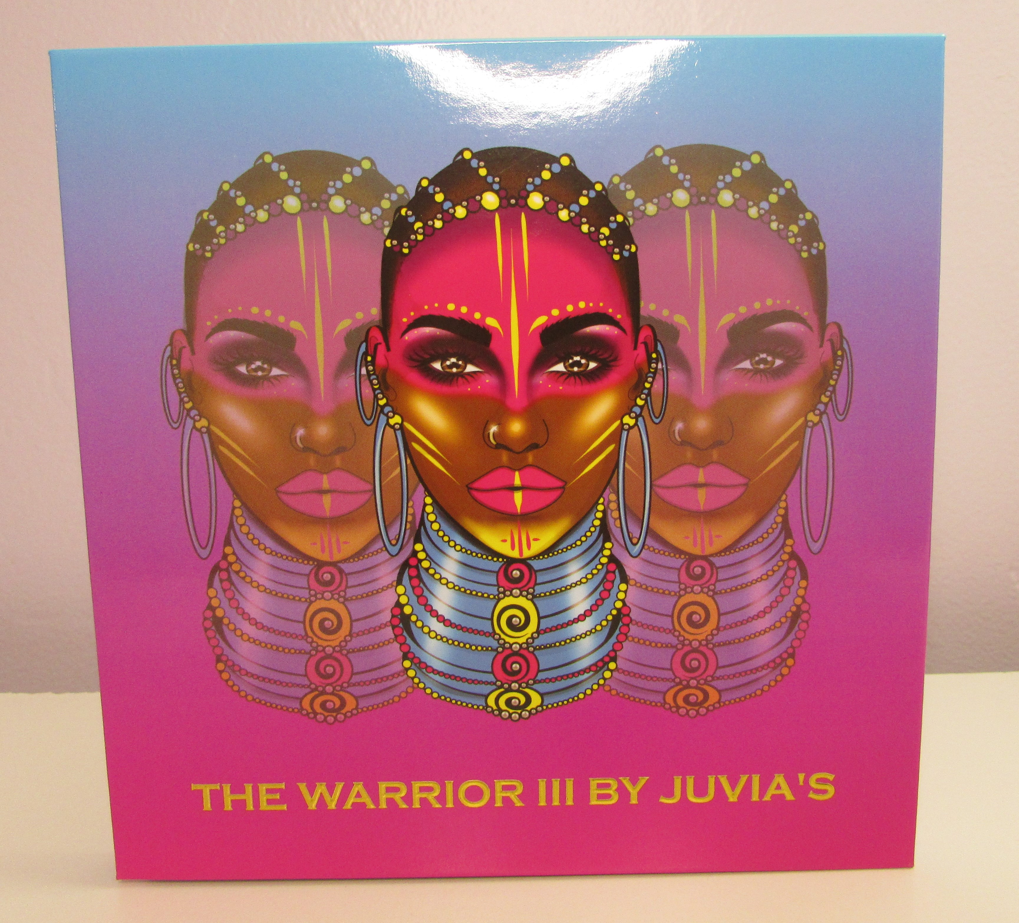 Of course as always the box art is amazing and very unique. I love the color scheme, it’s very bright, vivid and vaporwavey. The inside of the palette is also really cool with the gold geometric shapes framing the Warrior . The palette itself is a nice bold mix of colors, with mostly mattes and two metallic shades. I was particularly drawn to the three blues, the lighter pink and the green. The yellow is also very nice , especially since I don’t have a ton of yellow shades. But it looks like it’ll be a nice addition to the other yellows I have from other palettes.
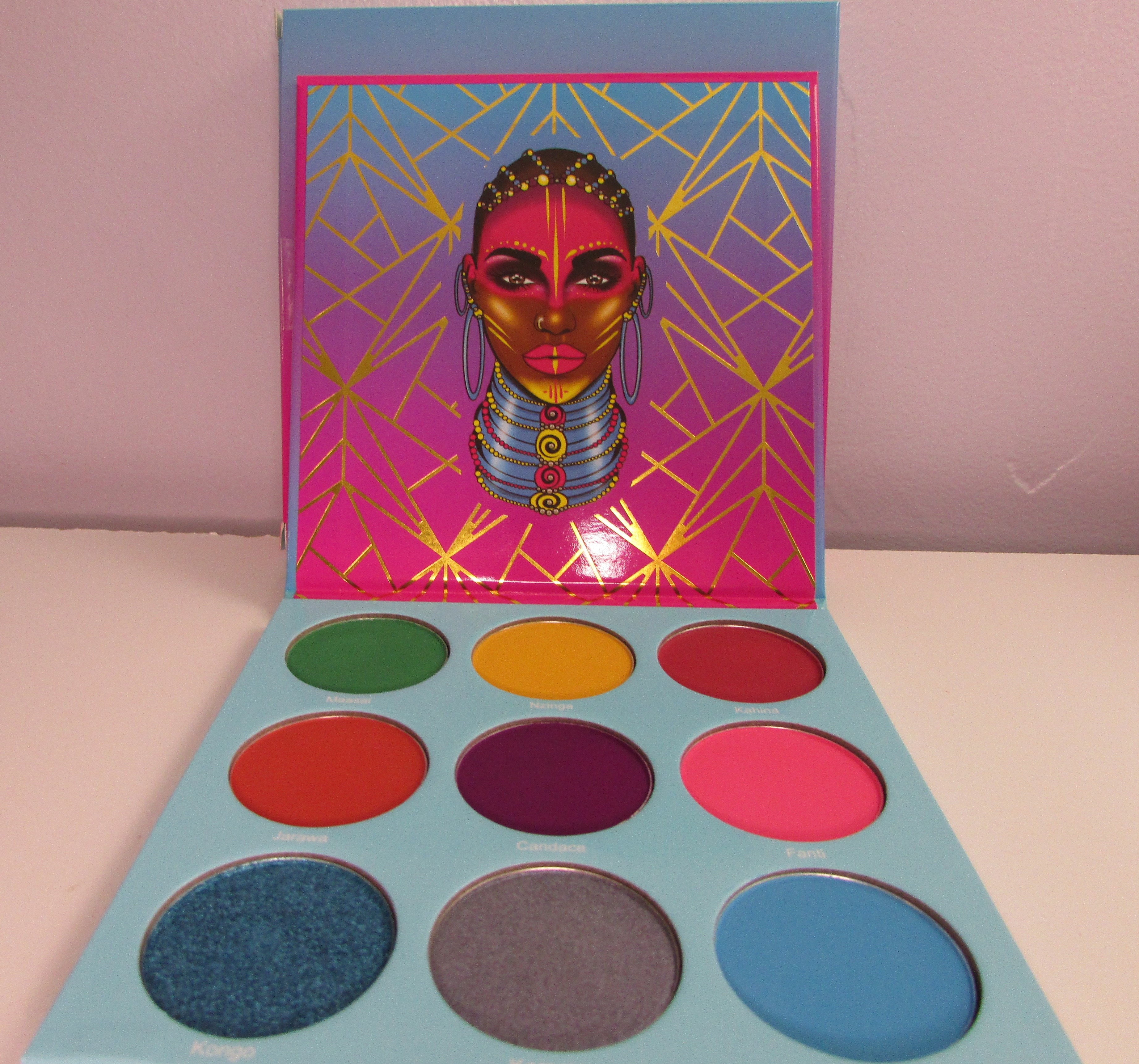 I wanted to take three pictures, One to display the beautiful art , the second to show off the nice colors and names, and finally a third to show off the two blues .
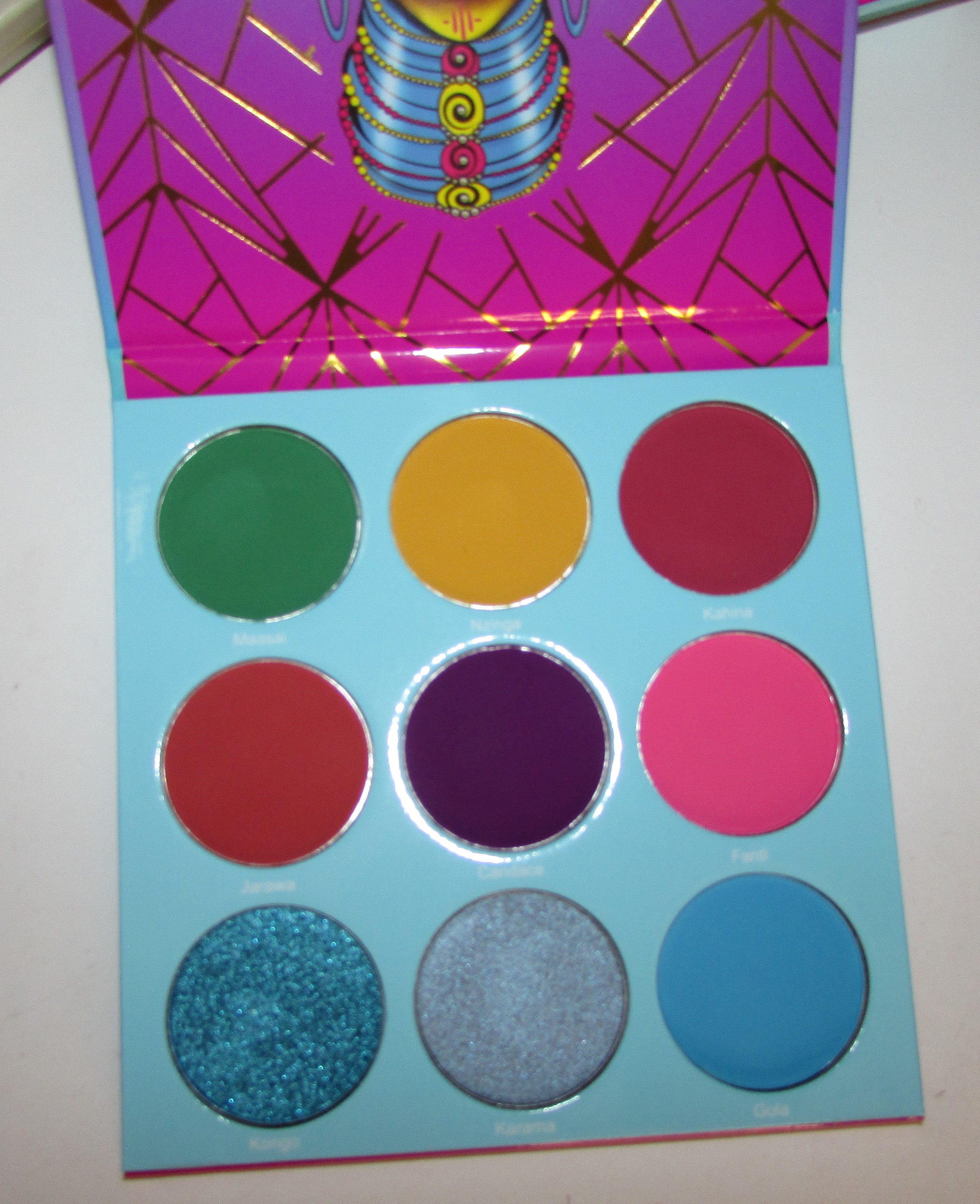
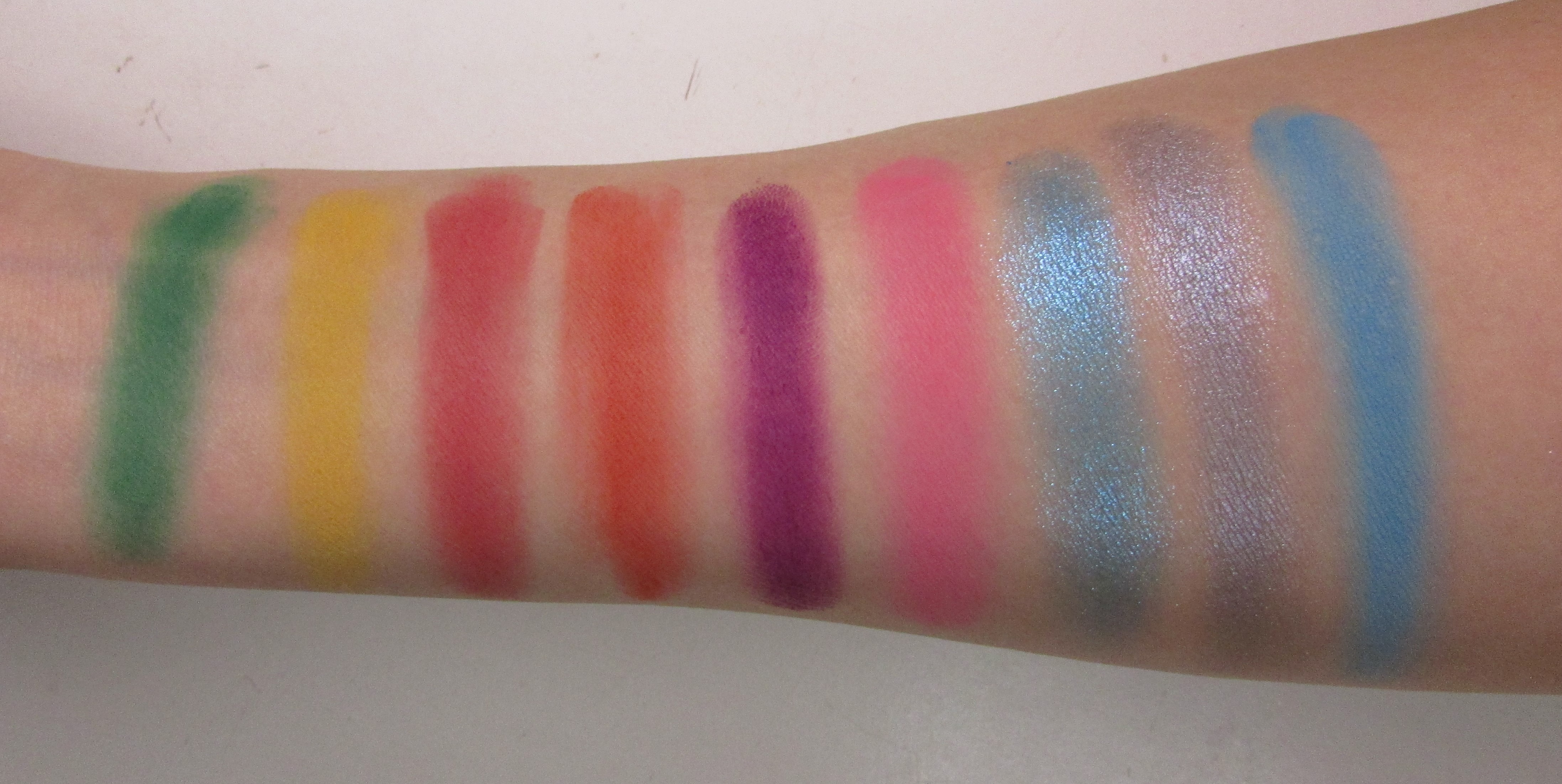 These honestly reminded me of the Fruit Stripe Zebra gum . Does anyone remember Fruit Stripe?
These all swatched beautifully . I can’t really say I have any dupes of these colors in my collection, except maybe for the powder blue. Gola is slightly similar to Eye-cing from the Glamlite Donut palette, but I think it’s actually a bit more a sky blue and lighter. The brick red and orange are also unique and I’m curious as to how these will look on the eyes.
- Maasai is one of the first colors I played around with, it’s a nice matte kelly green .
- Nzinga is a nice true yellow, it’s less bright than the yellow in the Zulu. But I think it blended a bit better than that yellow.
- Kahina is the nice matte brick red. It’s actually an earthier red , than what I was expecting, but I think it works out.
- Jarawa is also a unique shade for me , it’s like a nice earthy orange that reminds me of pottery or certain iron rich sands in the desert. It’s unusual in my collection but I appreciate that I’ve seen this color in nature.
- Candace is this nice kind of red toned eggplant purple. I have a similar shade in a Too Faced palette but it’s not as rich or applies as well as Candace.
- Fanti is nice cotton candy style pink , I really love this shade and was happy that I don’t appear to have duped it in either the Wahala or Sweet Pinks palette.
- Kongo is one of the main reasons I bought this palette , and I’m glad I did . It’s a truly unique dimensional cyber blue. I love this shade and it looks great on the eyes. It’s lighter than the blue shimmer in the Glamlite donut for those curious.
- Karama is the other shimmer shade that caught my eye, it’s a super icy silver toned blue. Very unique honestly.
- Gola is similar to Eye-cing, but it’s a bit lighter and more on the Sky Blue side . I love it and I’m happy to have a shade like this included .
Now for the looks I’ve been playing around with this palette for a while, I’ve mainly used this shadows with other palettes that I own. Mostly because I needed lighter colors or different contrasting shades. A few looks include the Clarion Angelfish look ,80’s look but with 2020’s quality makeup !, Franklin Delano Donut Pink and Blue Halo look,E.L.F Cosmetics Jelly Pop Dew Primer, Mystic Green look,Nyx Marshmellow Primer Review and Neon Skies look. These looks were all Warrior 3 shades with added palettes. I found that these colors work best as a supporting palette . But if you’re adventurous and want to experiment , you’re going to have fun.
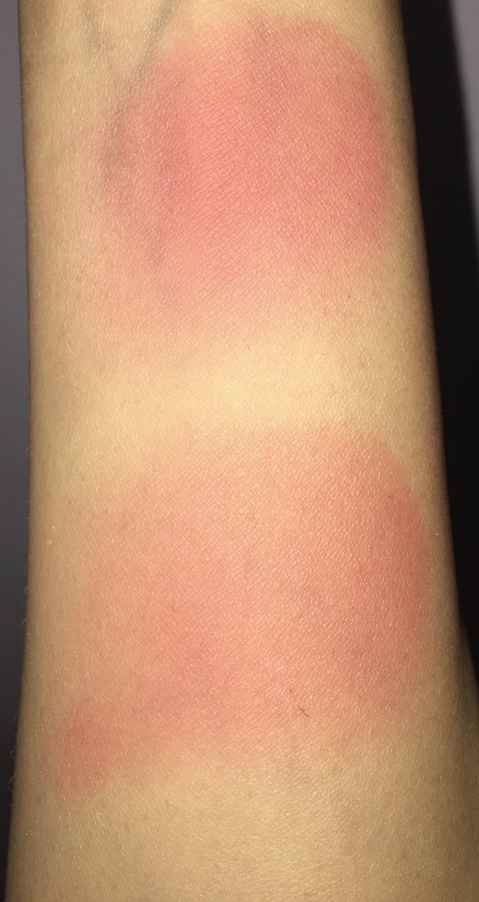
And before I forget here’s some pictures of Kahina and Jarwara applied using a blush brush . These would totally look nice as blushes for those interested.
Now for the Warrior 3 solo looks:
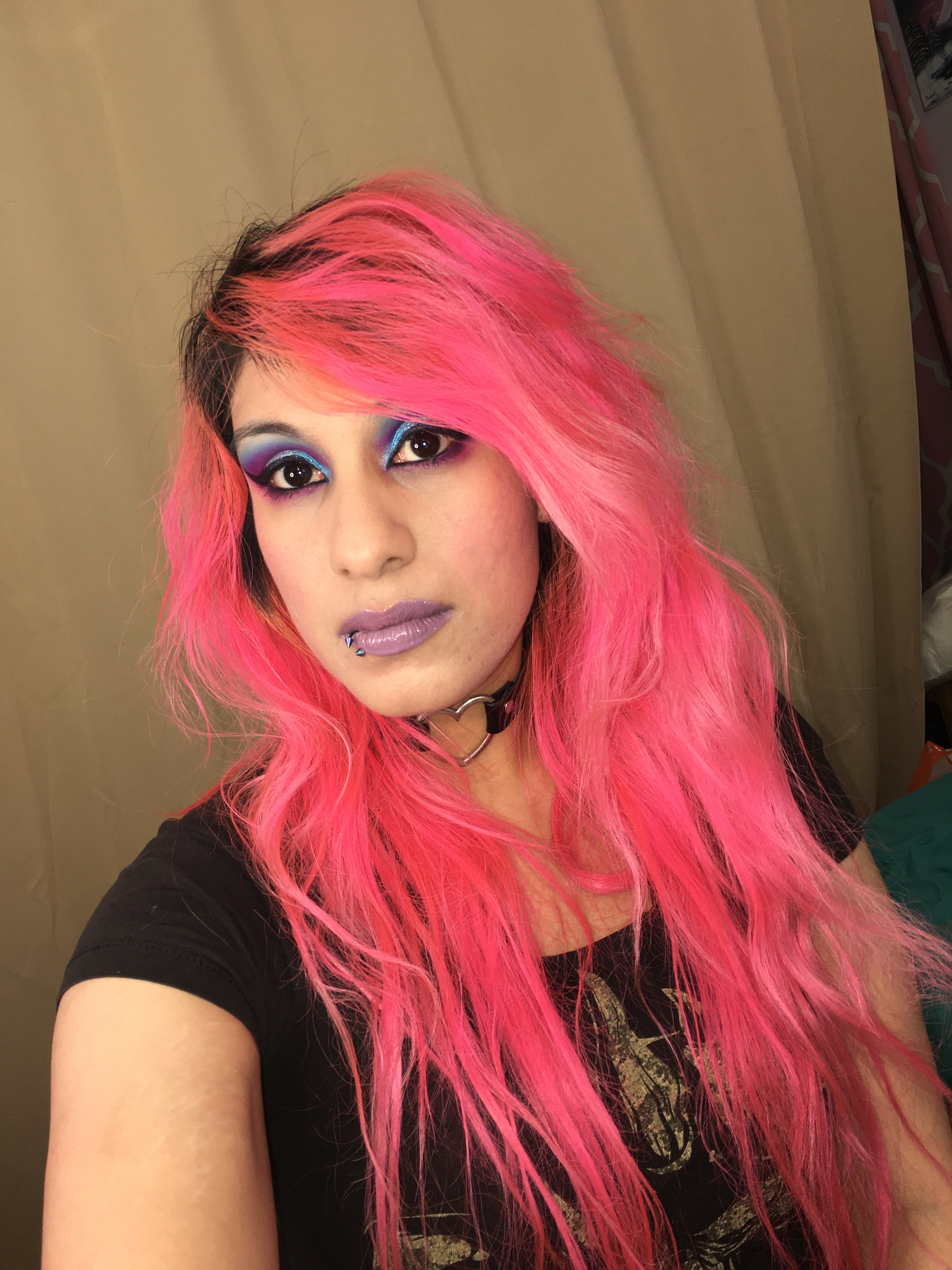
Dreampop look
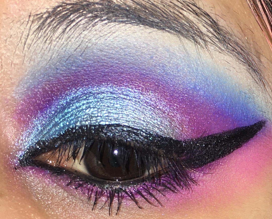
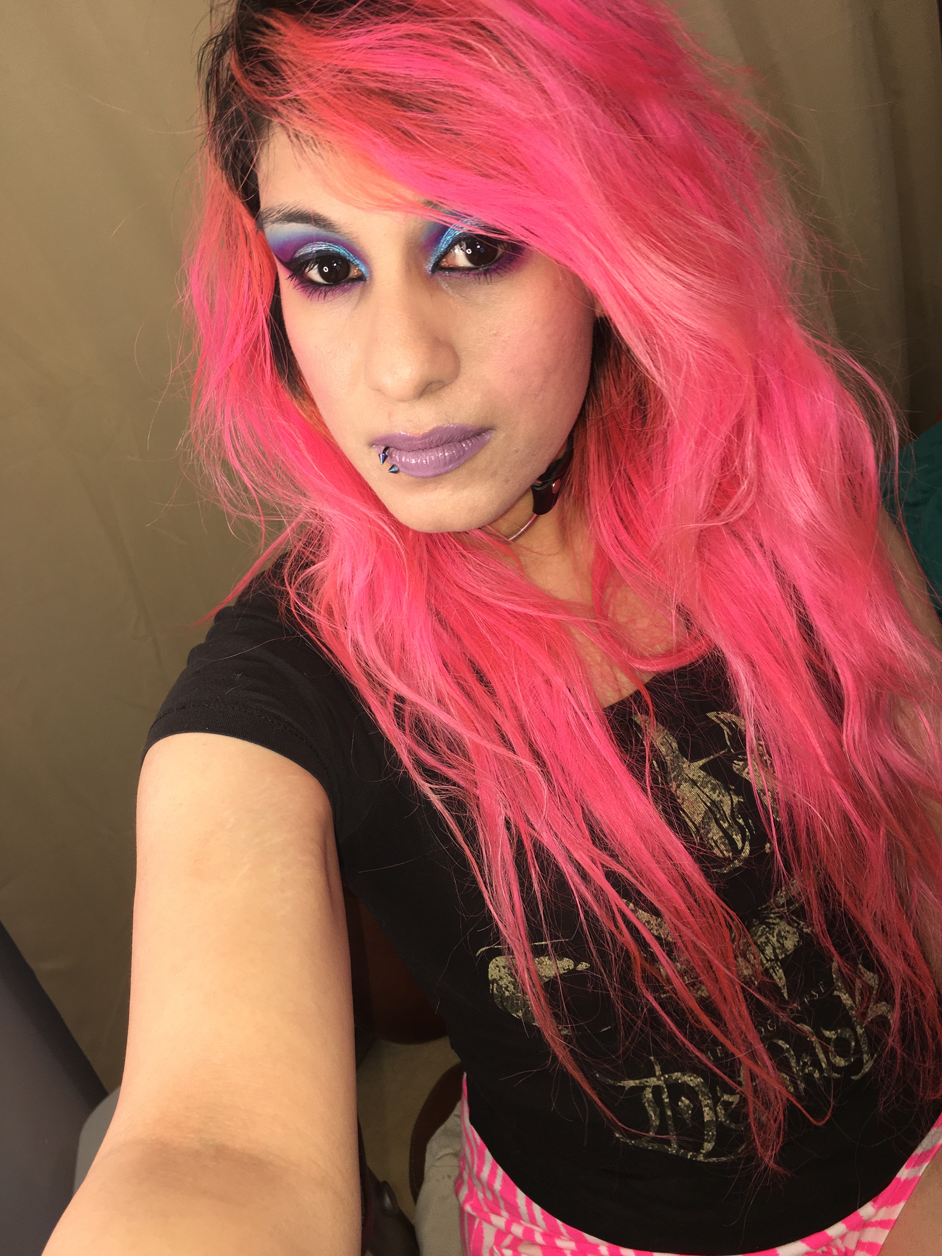
This was a look thats sort of 80’s inspired , but I also wanted to make a bit more modern. I used Fanti on my cheeks as well. It was at first very bright and a little harsh, but a little bit of blending with my beauty blender really softened it up. I honestly thought about it and it came to me Kahina and Jarawa would also make beautiful blushes but probably for deeper and darker skin tones. I did test them out on my arm and they can be blended out . Now for the rest of my eye look I used the colors Candace, Gola, Fanti, Kongo and Karama . Candice was a little tricky to blend as I packed it in and then blended it out with Gola. It took a little bit of extra time . But it was worth and it was super bold . So far this has been one of my favorite Warrior 3 only looks. Also I would like to add that the two blue shimmers work best with a glitter glue. It really helps them stay put and last all day.
My next look is based on the green Amazon Parrot 🦜 . I tried a similar look before but it looked a bit rough as I didn’t have a lot of time to blend. But today is different , I took my time and added a nice red line at the bottom of my eyes for parrot vibes . The colors I used were Nzinga , Maasai ,blended Gola( the bright blue ) into Maasai , and for the middle of my eyes and inner corner I used Kongo and Karama . And finally the nice red line meant to represent the red tail feathers on the parrot I used was Kahina.
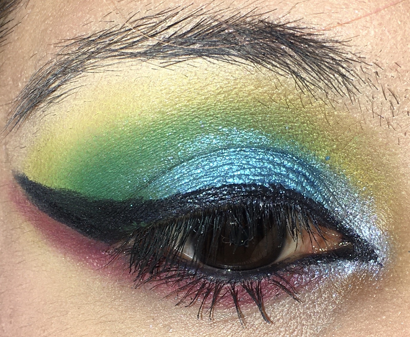
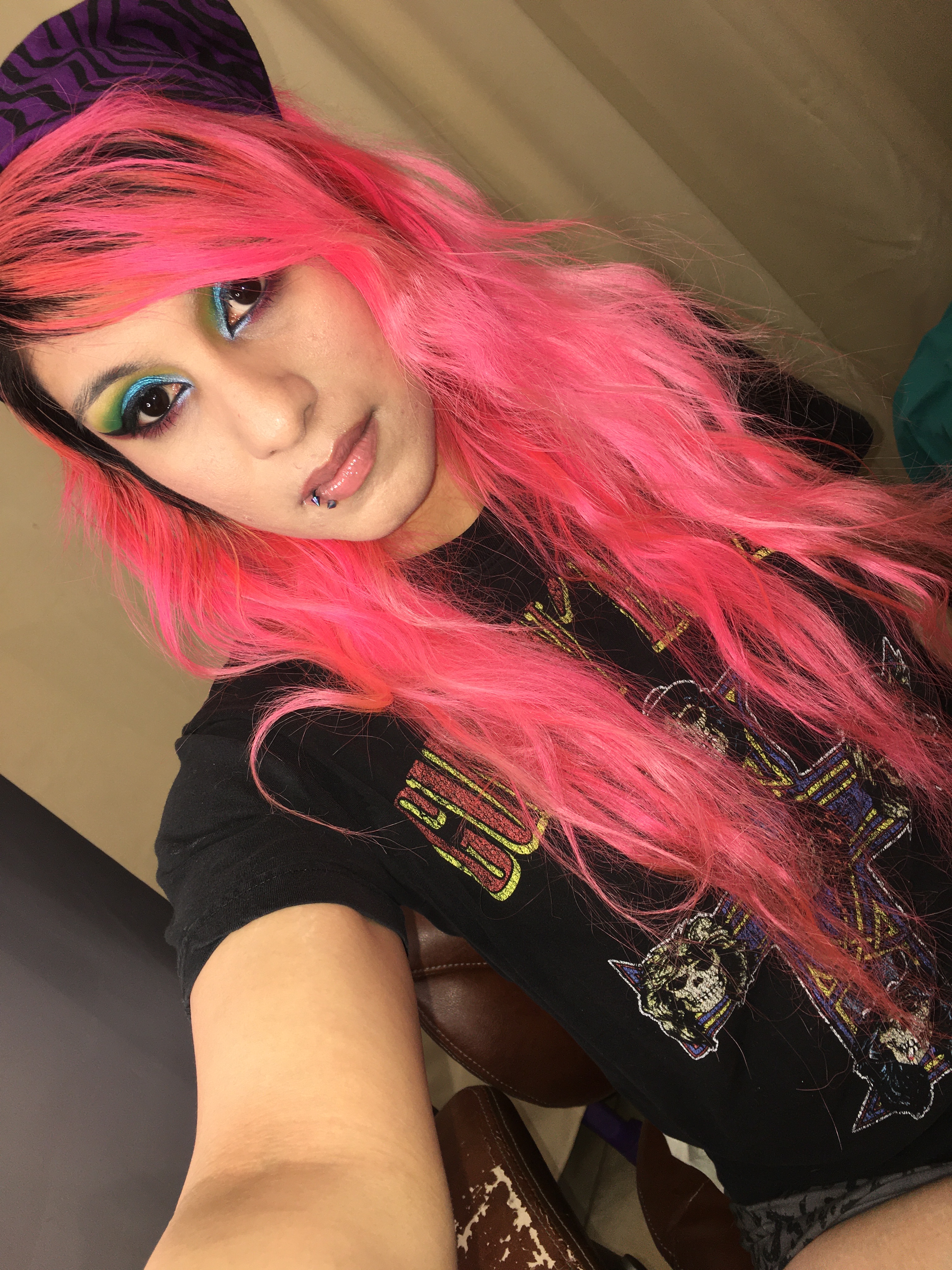
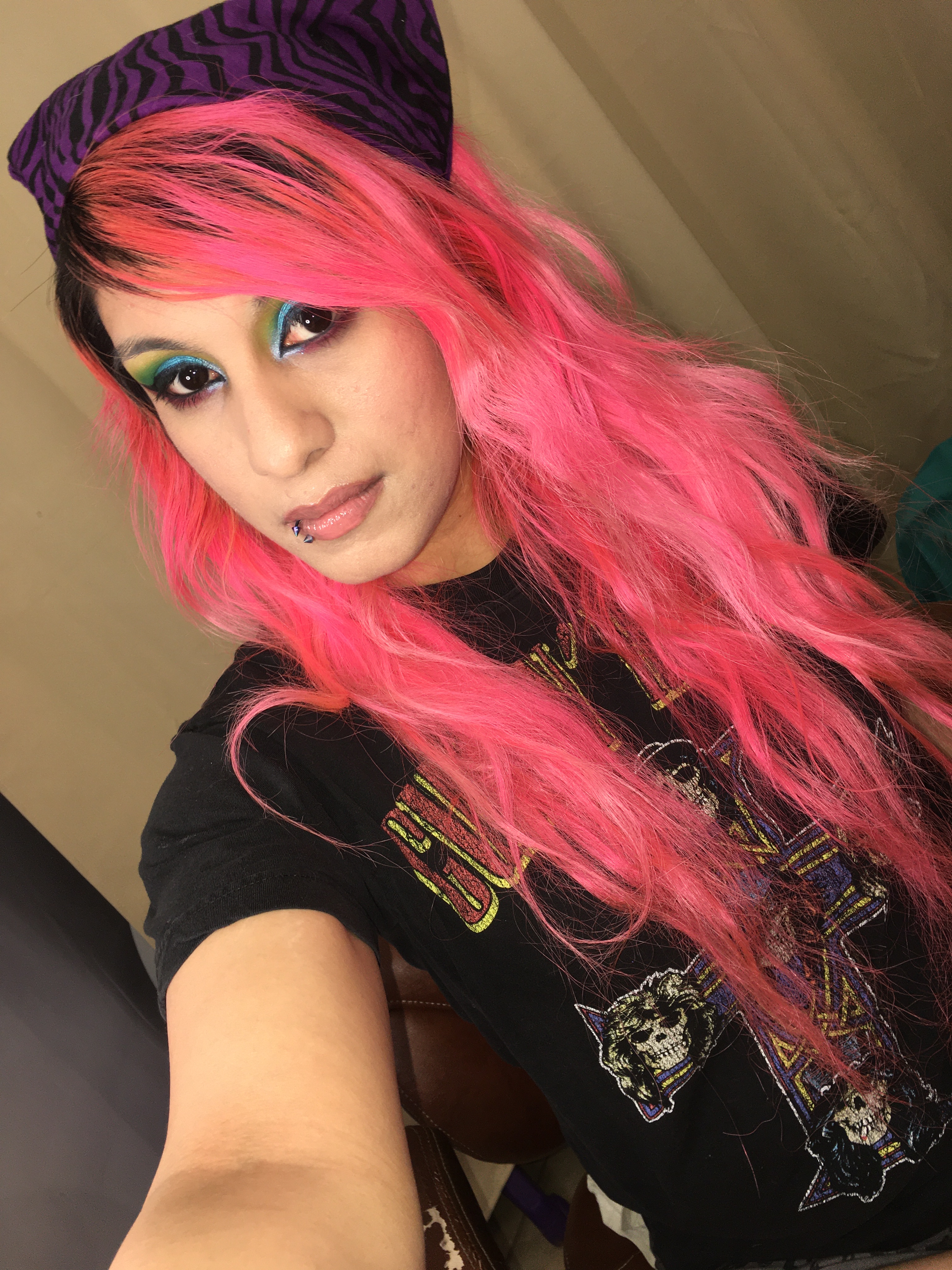
Okay , maybe the parrot look is my favorite 🦜🦜🦜.
And for my final look ! I took inspiration from the desert. Specifically both the Sedona desert in AZ and the Namib Desert in Namibia . My reasoning is both deserts have a nice red and orange hue, very similar to how Kahina and Jarawa look . I also had this idea after looking at pictures of the desert (specifically the Namib desert) of using Gola ( the nice matte blue) to represent the sky. Candance and Kahina were mixed to get kind of wine burgundy look of the sands , and then I added both Jarawa and Nzinga on my lids . I probably used a bit too much of Candance for what I was going for but it seemed to have worked out okay.
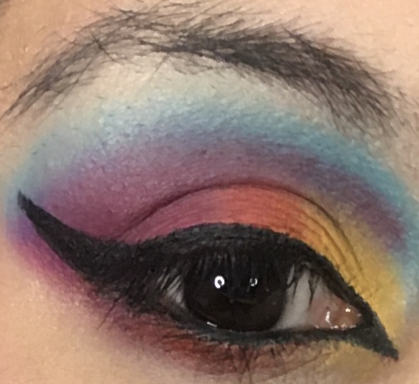
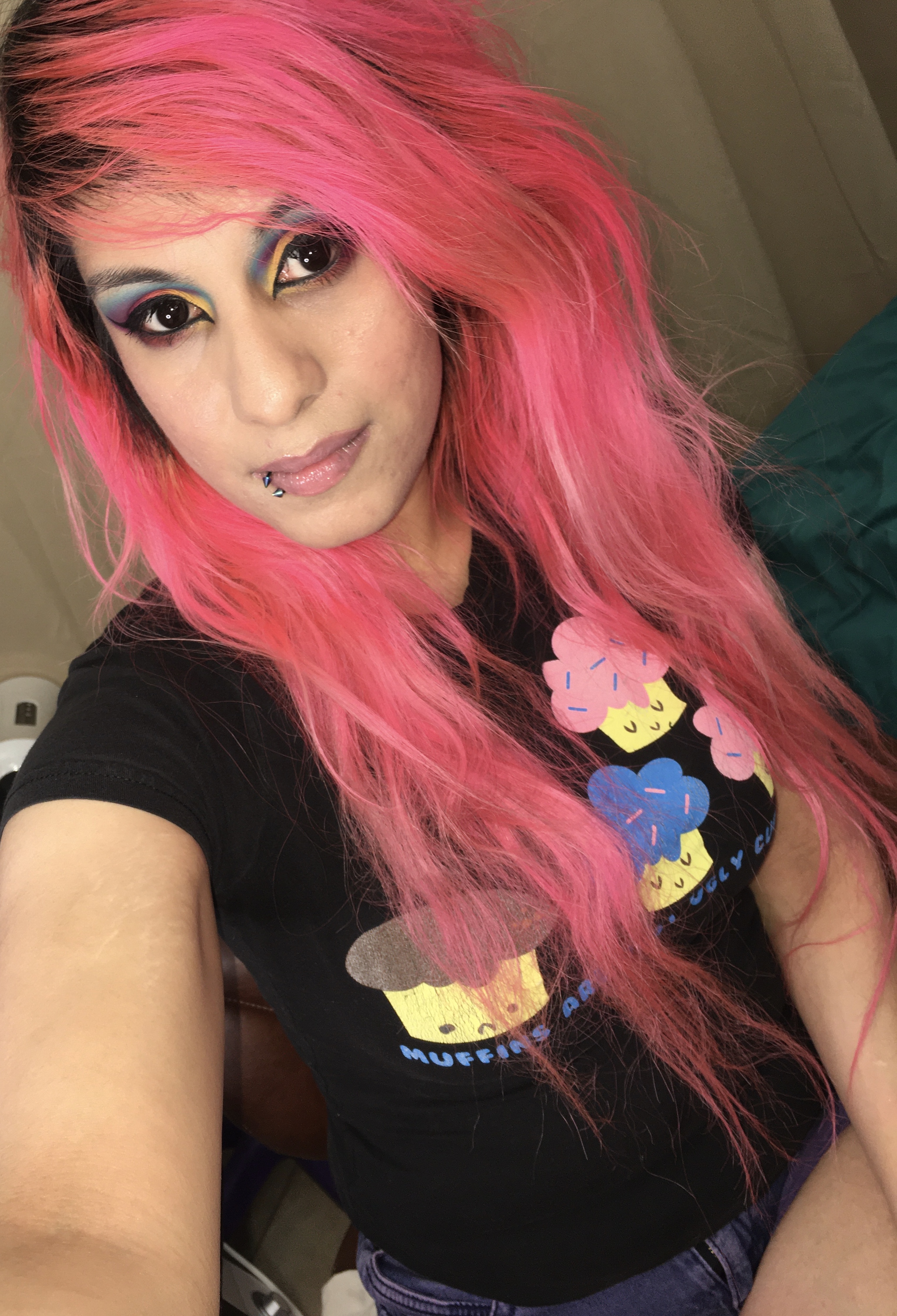
After wearing this palette and using it with my other shadows , I finally understand the color story a bit better . It’s definitely bold , but the colors work well , even if you do have to think outside the box . Some of the dark shades like Candace , Maasai and Kahina take a bit more time to blend out , but they do blend . Also using a good white shadow base or primer will make these shadows really stand out . And glitter glue works well for the two shimmer blue shades. So let me know in the comments section on what you think about The Warrior 3 , do you own it already ?



I don’t read/follow very many eyeliner blogs! So I hope you enjoyed a small shoutout on my last post on Pinkiesparadise! You are the one way more badass than that stupid game!
😂
LikeLiked by 1 person
Hahah thanks ! I’ll go check out the post ! I did see you reviewed a game you didn’t really care for lol .
LikeLiked by 1 person
Yes, I don’t review very many games I do care for 😂
LikeLiked by 1 person
But hey if you review enough bad games , once you find one you like , it’ll be super hood by comparison. It’s like a palette cleanser.
LikeLiked by 1 person
That’s true. I guess if all you ate your whole life was Brussels sprouts and then one day someone handed you an apple you’d think it was cake. Err something 🤷🏻♂️😂😂
LikeLiked by 1 person
Lol ! Maybe play a Persona game . They’re a really good rpg with a good battle system and storyline. I liked Persona 4 but I’ve played the Shin Megami Tensei games that are made from the same company and have the same battle system.
LikeLiked by 1 person
I would love to but they are quite rare. Many of the games are pretty expensive as well
LikeLiked by 1 person
I guess thats true . But if you have a powerful computer emulators can be good . But I hear you on how certain older games are to find .
LikeLiked by 1 person
I’m old school. I like getting all physical copies. I don’t believe in digital copies of stuff. I think it’s better for the environment and am for it in general – but I only like old and pre owned stuff anyways 😂 I don’t know I’m a weirdo. I still collect dvds. I don’t trust the internet or the cloud 🤷🏻♂️
LikeLiked by 1 person
I do prefer physical games too , just certain ones I will emulate since they are pretty hard to find . But the great thing about physical games is you can trade them or resell them too .
LikeLiked by 1 person
Oh wow this pallet is gorgggg!! Love this look 💗
LikeLiked by 1 person
Thanks ! I really loved playing around with this palette . I think if you wanted a fun colorful palette to wear or experiment with this would be awesome , same with the Zulu which has a similar bright color story. Also I’ll have to send you some pics on IG , but I have some new birthday palettes 😊
LikeLiked by 1 person
Yayyyy love to see it!
LikeLiked by 1 person
😊✨
LikeLiked by 1 person
Such a fun and pigmented palette. You certainly know how to get the most out of a color story. I’m trying (send help lol). Those rainbow lids are beautiful. My girls will lose their minds if I show them.
LikeLiked by 1 person
It’s definitely a bright palette . I played with it for almost a month with a few other palettes to get a feel for it . I do try to look at pictures of flowers , lizards , fish and some other things for inspiration sometimes .
LikeLiked by 1 person
Genius
LikeLiked by 1 person
Hahah thanks 😊
LikeLike