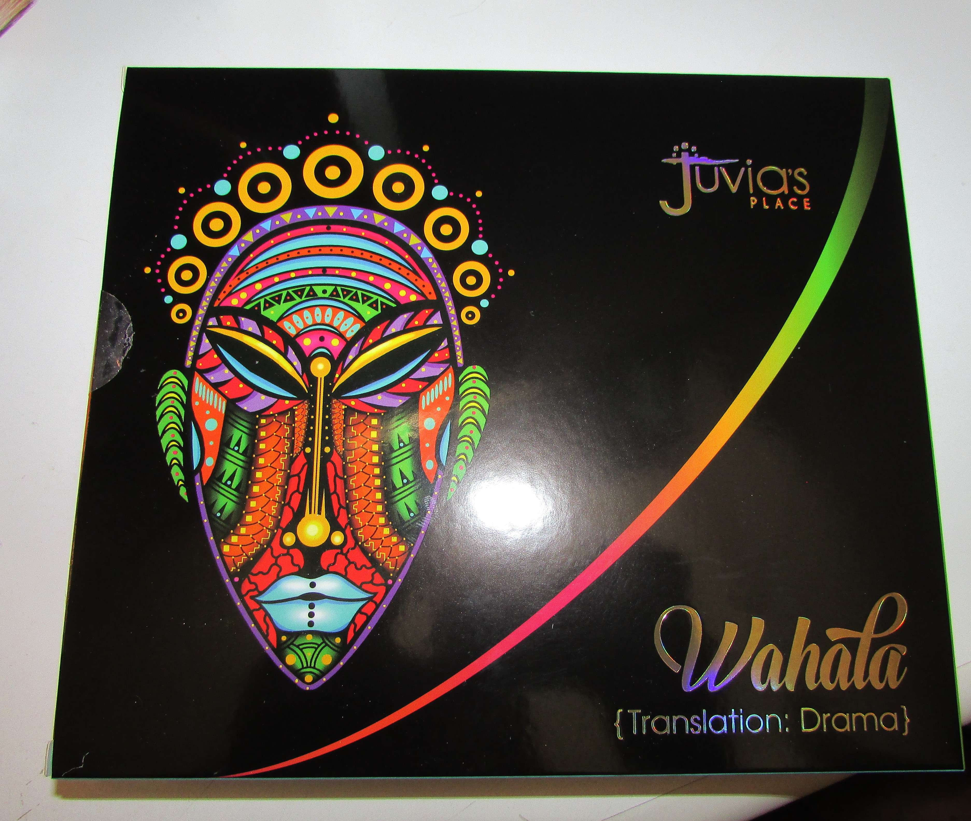
It’s finally here ! Its taken a while for shipping and also just playing around with the colors. But I’ve finally gotten around to taking uploading pictures and writing this all down. For my reviews of palettes I generally try to use every color I can, this helps me get a feel for formula , color placement and combinations. As you may know from reading my other posts, the first time this palette was released in May, it sold out before I could order. This is a very hyped about and popular Juvia’s Place palette. And for good reason, the color story and finishes are really fun and bold. The name of this palette, Wahala is Nigerian for Drama, and the cover art features a really colorful mask. So with keeping with the dramatic theme , I decided to go bold and do some eye looks that are slightly mask like. or at least eyemask like. Lets of course get into the packaging and colors first.

The packaging is very sleek, and comes housed in a box with bubble wrap. The inside designs are really nice, black, bright yellow, a gold line and bright sky blue.
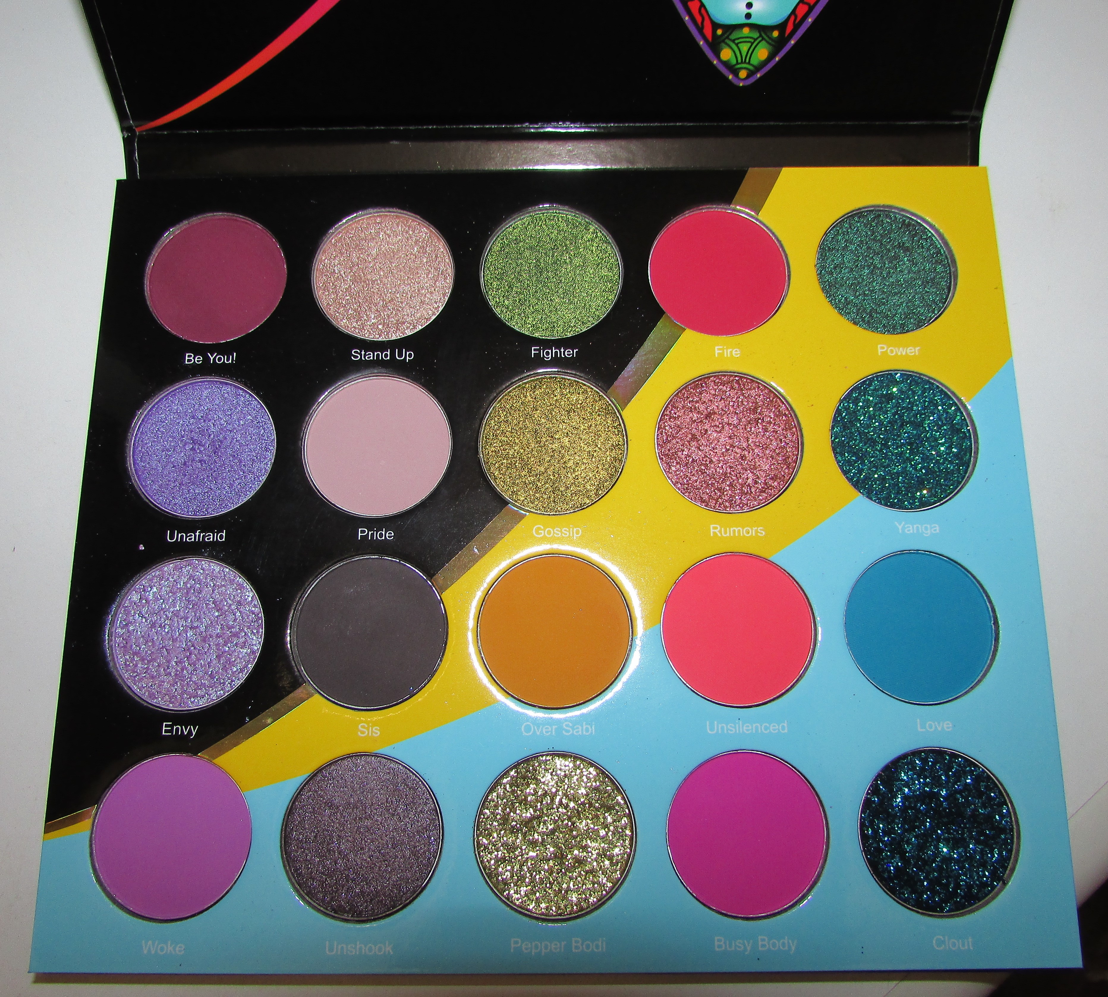
I tried taking two different angled pictures to show off the shift of some of the duochromes and glitters. Clout and Yanga are especially shifty for pressed glitters. Power is also a very interesting duochrome shade, its hard to photograph the nice blue to oil slick green shift.
And now on to the swatches. I had to take two different pictures along with flash, plus use a primer for the shade Pride ( it can be hard to see on my skin). For one picture the Mattes showed up great but the pressed glitters looked odd and the other one the mattes looked off.
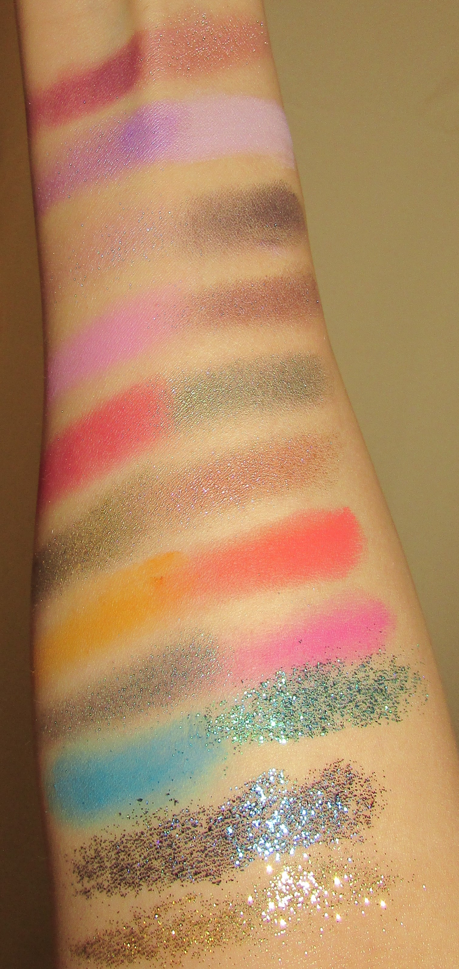

As you can see the bottom picture captures the glitters a lot better than the top. For all my pictures for this review I’ll alternate between cameras and lighting.
Some of the mattes were a bit hard to swatch but they applied wonderfully over a eye base or primer. the duochromes were easy to work as well. For the pressed glitter shades I used a glitter glue to help them stay put. I’ll go on a bit about the colors were right now ,by starting from left to right, and top to bottom.
- Be You is a matte Burgundy or berry shade. This has become one of my favorites as it’s a very romantic color that I don’t have a dupe for.
- Unafraid is Shimmery purple with a bit of a frosty finish.
- Envy is shimmery pink-violet duchrome with light blue pearls.
- Woke a matte light lavender . This is one of my favorite mattes in the palette.
- Standup a shimmery champagne color. Its one of the best champagne colors in my collection currently.
- Pride , a nice matte mauve cool toned taupe .Its super light on my skin . And on my swatches , I used a eye base so you could see it better. I like using this on my brow but I could see using this to make a more neutral look with the palette.
- Sis a cool toned coal black . It says on the site its a cool toned brown , but it looks more like a soft coal black too me . I likedd how this applied and how easy it was to work with.
- Unshook is a shimmery black , but can read a bit silver on the lids . I also noticed a bit if pink glitter too .
- Fighter – a beautiful shimmery metallic green with a bit of gold shift . It applies like butter .
- Gossip is a wonderful metallic gold with a bit of a green shift. I’m not usually the biggest fan of golds but this is pretty unique in my collection and has a beautiful shift.
- Over Sabi , is a really nice darker mustard yellow . I have a few shades of this color but this is probably one of the nicest mustard yellows in my collection. Its great as a brow shade and blends out nicely.
- Pepper Bodi is gold pressed glitter . I haven’t used it as much but its a pretty nice glitter . For all three pressed glitters I used Too Faced Glitter Glue and applied with a flat brush . This method worked really well and to take off the glitter I used a piece of tape .
- Fire is a matte vibrant red . Its seems more of a cool red , but bright . I don’t have a shade like this in my collection .
- Rumors is a beautiful rose toned copper . Well its sort of copper , but maybe its more rose champagne to be honest .
- Unsilenced is a matte bright coral color . It leans a bit more on the pink side of coral , and it applies beautifully .
- Busy Body is a matte bright bubble gum pink . I love this shade .
- Power is a blue duochrome with an oilslick green teal shift . I love this color , its a bit of mermaid shade.
- Yanga is bright aqua pressed glitter with a bit of a green shift.
- Love is intersting as they named a blue shade love . I ususlly see companies use red or pink for love , but its pretty nice seeing a calm color like blue represented as love . Its a matte bright cyan shade.
- Clout is the last pressed glitter shade . This is a nice blue with a blurple shift .
So about the formula , the mattes all applied well and blended out nicely. I heard some people say Fire could’ve been better but I didn’t have any troubles with using it with my eyelooks . Pride was a nice neutral matte , but I definitely needed a base for it to show up . Also Sis , the ash black was really easy to use in crease and blended well with other colors .
The duochromes are a super nice addition and some of the most unique shades in my collection . Power being a stand out favorite . I think this color would look amazing on deeper skin tones , but you can work with it even on light skin too . I love the shift .The metallic colors are also easy to apply and work with . Rumors being one of my favorites too.Unafraid the shimmery lavender is a bit sheer but makes a nice topper shade for the other mattes or as a inner corner shade.
And finally the three glitter shades , these are best for layered looks , but a few looks I just pressed them on to use to seperate colors . These are by far better than the pressed glitters in the Bird of Paradise palette I reviewed earlier this spring. The two blue glitters also had shift . The gold was probably my least favorite but , I could see using it with the red and burgundy colors .
So finally on to the looks . These were all created with the dramatic theme in mind and many used as many of the shades as I could . One look was inspired by a Instagram post, I’ll link her look so you can see the inspiration .
First look Cotton Candy stripes!

This look was partially inspired by the box art of the mask. Theres stripes around the mask’s eyes , and I thought it would be cool to do a cotton candy, unicorn theme to match my hair at the time. I used Love and Busy Body, but I blended too much with out cleaning my brush so Busy Body looks more purple than pink. afterwards I cut the crease and used Unafraid,Woke, and Envy ( all the purples). and then I decided to add Pride on the brow and Unsilenced underneath my lashline.
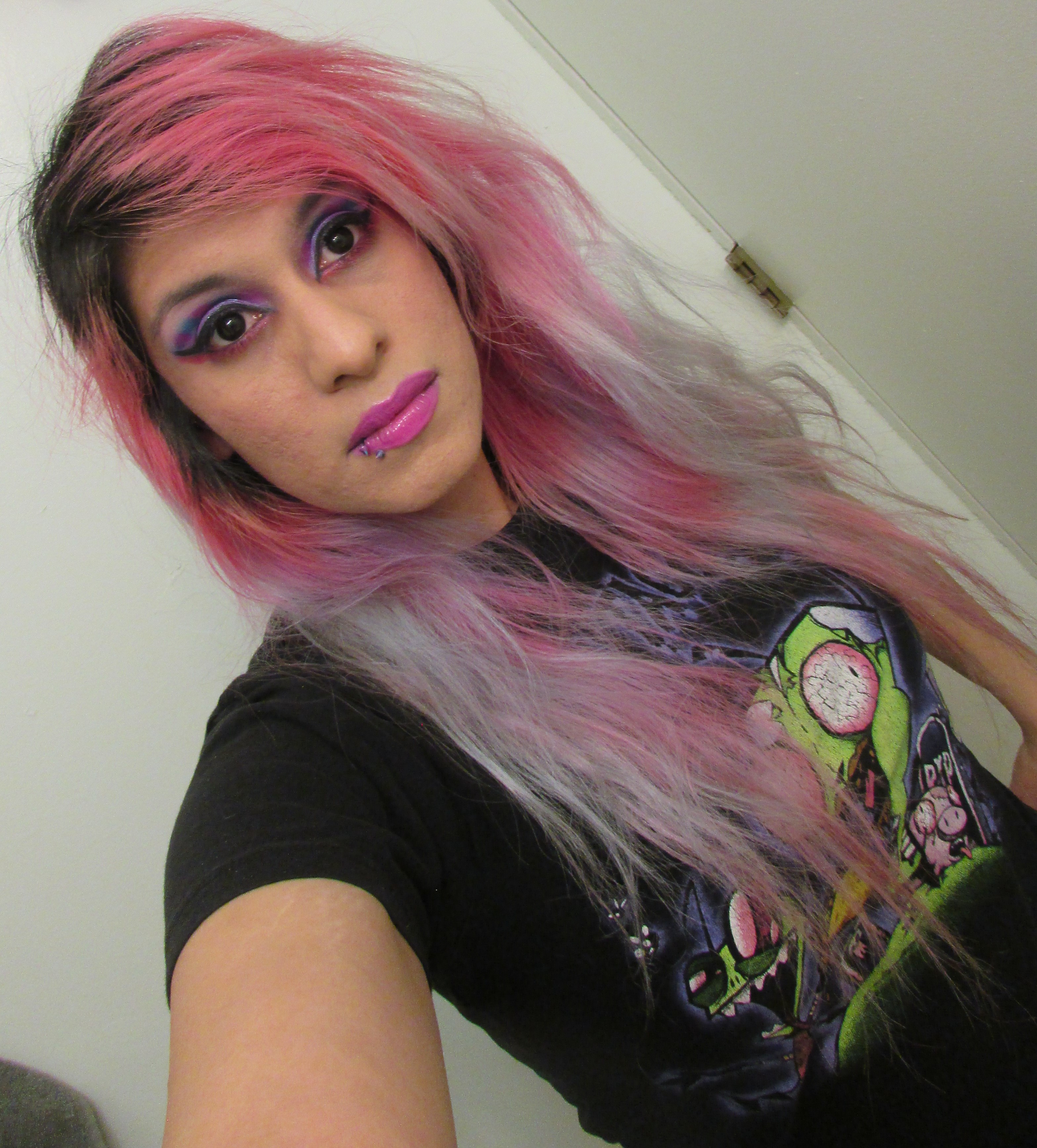
I think it looks best from far away tbh.
My next look is based on Everythingbeauty992’s bold punk inspired look on Instagram.
And now my take on this look.


used a different eyeshape for the colors, but I used Unsilenced,Busy Body, and Sis for the black areas. Afterwards I used Unshook in the middle of my eye, with Fire on the bottom of my eyes.

Next look I was going for a more romantic feel. So I used Be You! Pride and Sis to try and create a bit of a smoky look. I used both Stand Up and Rumors on the middle of my eyes. I kept this look a bit more simple and just added liner.

And now that concludes the main part of the Wahala palette review. I had alot of fun making looks and trying out the new colors. But I made a total of six looks , and because this review is so long, I thought it would be best to show these first three and then show the rest on a separate post.
Overall I really like the formula and color story of the Wahala palette, I definitely recommend this palette to bold and color lovers. Even if you just like collecting Juvia’s Place palettes this one is really nice and has some amazing duochromes. At this moment it is one of my favorite palettes, and really makes me want to try different combos and try to branch out of my normal color range. I still plan on doing a nice live video of the Palette plus a totally different look than the ones I showed on here or part two. So stay tuned. Have a nice week everyone, and let me know in the comments what you think of the palette.


I love colorful palettes and this one is super gorgeous also totally love the beautiful looks created!!
LikeLiked by 2 people
Thanks ! Its was really fun trying to think of new color combos and looks ☺️
LikeLiked by 1 person
This is such a good blog babe. I’m really keen to try this palette. The colours do look beautiful!!! Thank you so much for the mention 🙂 it means alot that u were inspired by my look I created. Excited to look Into trying the palette.
LikeLiked by 2 people
Thanks ☺️ and I did see they restocked some more palettes . Let me know if you manage to get one . And thanks ! Your look was really fun to try and replicate . I may try it again with a different color scheme too .
LikeLike
I love the color combo and looks you came up with! The swatches are really nice as well ☺️
LikeLiked by 2 people
Thanks ! It was really a lot of fun , and I liked trying to think of new combos . I will still do a live stream but not sure what color combo I’ll do. Might be something totally different .
LikeLiked by 1 person
So excited to see you have a review on the Juvia’s Place Wahala Palette! I really enjoyed the level of detail in your review on the palette, seeing the swatches and getting the look ideas. Are the glitters quite loose (even though they are pressed) or do they stay together well when you pick them up to apply them to the eye? I’m looking forward to when Beauty Bay finally gets it in stock for the UK so that I can try it out.
LikeLiked by 2 people
Oh thanks☺️ The pressed glitters stay together easy , and aren’t really loose . Which is super good for storing the palette , I don’t have to worry about them shifting around . But I do recommend a glitter glue and a stiff brush to apply them with. I hope Beauty Bay gets them stocked , I think you’ll really like the colors and duochromes ☺️
LikeLike
I messaged Beauty Bay a while ago and they said they were going to get the palette in at some point. Be great when they finally get it in!
LikeLiked by 1 person
Oh nice ! That’s awesome ! Maybe they’ll get the nude lipsticks as well on Beauty Bay too . I talk to someone in else in the UK who wanted to try some of the newer Juvia’s Place products .
LikeLike
I’m really impressed by the range in this palette! I’ve found some JP palettes to be similar in that they don’t swatch the most consistently but then perform much better!
LikeLiked by 2 people
Yeah my Zulu palette didn’t swatch very well , but wore well on the eyes . Same with the Douce .
LikeLike
wow this palette look really nice 😀
i’m not sure how i feel about all the mattes being in the same color family, but overall, the color story is really nice 🙂 thanks for reviewing 🙂
LikeLiked by 1 person
Thanks for reading💕The mattes are very interesting picks , but I don’t mind too much as I have a varied matte collection so I can pull out other colors if needed .
LikeLiked by 1 person