
It seems like everyone has tried out a Juvia’s Place palette except for me. I was pretty curious about the colors and staying power and loved everyone’s looks online. So I thought if I was going to try something from the brand I might as well start witha brights palette. The Zulu is definitely bright and pigmented. Well Actually it may be my brightest and most pigmented palette that I own currently. Way brighter than Urban Decay Electric, but I’m still able to blend and mix and match. Lets check out these beautiful colors and box art.

So the packaging for the palette is pretty nice, its a shiny cardboard box , while inside the palette is packed in bubblewrap. The palette itself is very thin , and compact, So it would probably be easy to travel with. I didn’t mind the lack of a mirror since the art inside is so pretty and gives The Zulu palette it’s personality. I’ve read on an interview that the artwork is inspired by the arts and culture of the Ndebele people of South Africa and Zimbabwe. And now to the colors themselves.
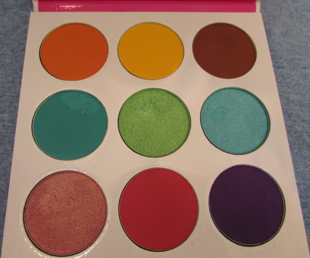
So there are no printed names on the palette itself, I even went on to Juvia’s offical shop site and just found numbers. oh well they’re still pretty though so lets look at which colors we have.
From top left to right
Shade One is a matte Tangerine orange, its very vibrant, blends very well in the crease and brow. It can stain , so I would definitely recommend using a primer, eyeshadow base and probable an oil based eyemakeup remover.
Shade Two is a matte canary yellow as descibed by the Juvia’s Place site. its a very sunny yellow that I really like and I honestly don’t have too many yellows. I’ve read some reviews saying this sheered out a lot, but for me it was super bright. its also blends well with the tangerine, magenta, and pecan colors in the palette.
Shade Three is is a super nice matte pecan/mahagony color. I was honestly surprised with how well this blended and worked with the other colors. It’s a very deep color but blends out and is probably one of the better natural shades in my collection.
Shade 4 is also a matte shade , its a jade/teal color. I had some issues blending it out but I found it works really well as liner shade. its a bit stiffer than the other colors, but overall I liked it.
Shade 5 is probably one of my favorite colors from the palette. its a beautiful metallic lime green and it just looks amazing on the eyes .
Shade 6 is a beautiful sparkly Aqua/cyan color. I have quite a few blue shades in my personal collection but this one still is amazing to look at. online it looked a bit more teal but in person it’s definitely more of a cyan blue.
Shade 7 is a duochrome peachy pink with a bit of a gold shift. Its one of my other favorite colors.
Shade 8 So online this color is described as a matte megenta pink but to me its more of a watermelon color. I think there was a hair dye called watermelon pink and it was a very similar color.
Shade 9 is finally the amazing matte bright purple. this color looks great patted on for a darker look or blended out for a more muted look. Its a great purple shadow .
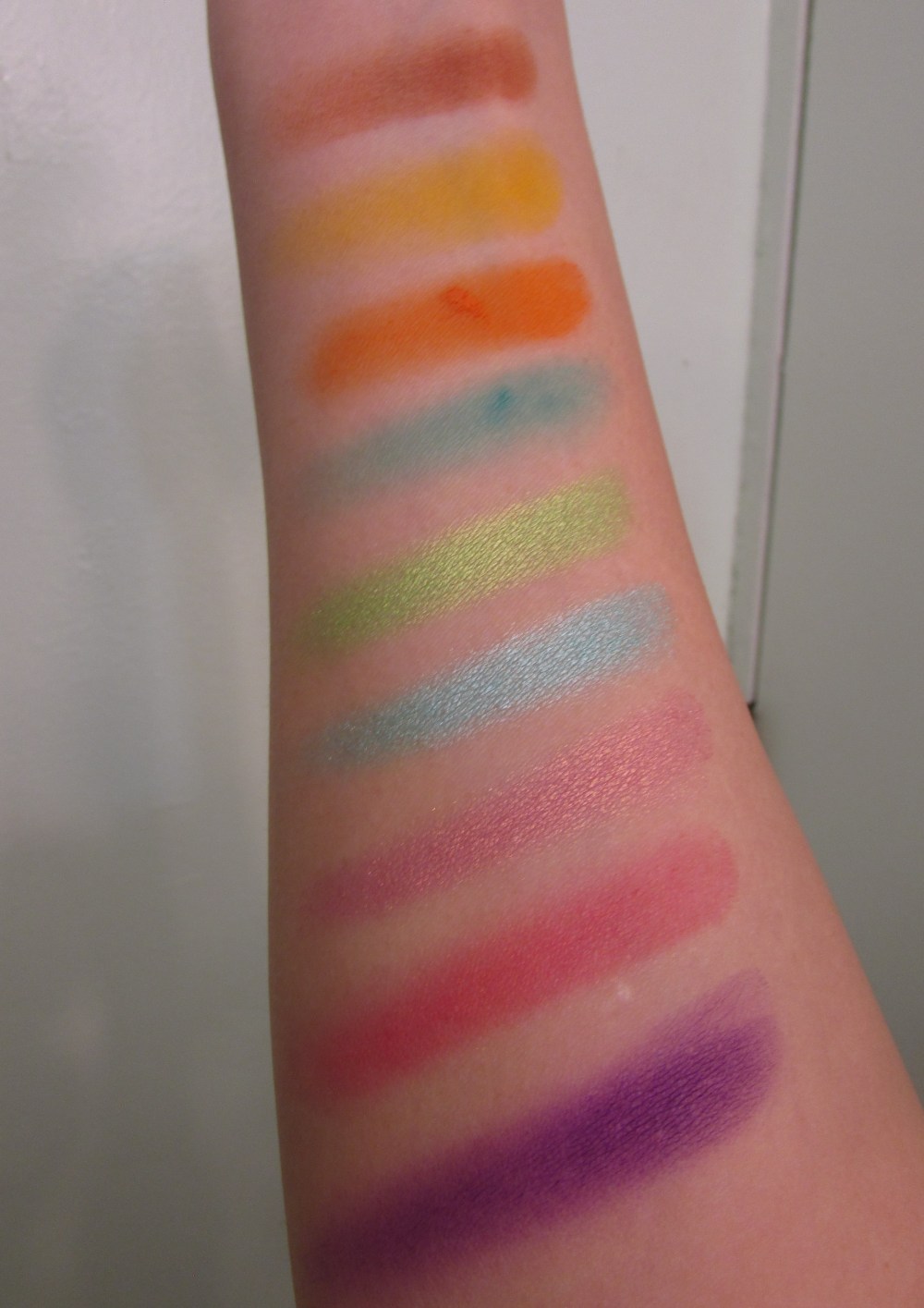
So the formua itself is very bright and pigmented, most colors are easy to blend out or diffuse. With the matte jade/teal color being a bit harder to diffuse. I honestly had no problems trying different eye looks, or blending most of the colors together. the matte pecan brown was a pleasant surprise as it was one of the nicest looking warm brown colors that didn’t look out of place in a bright’s palette. I may have to try one of the Juvia’s neutral palettes now. Also the three metallic colors all performed well and were great as lid colors.All of the colors look best when used over a white eyeshadow base and this also saves your eyes from some of the intense staining that the bright pink,orange and purple colors can do. I believe those colors are labeled as being possibly problematic if you have sensitive eyes. I didn’t have any issues aside from some staining but definitely be mindful of that. I think thats just a warning that all pressed pigment style shadows have. I think if I were to compare a brand’s formula to this Juvia’s Place it would probably be Sugarpill’s. They’re not quite the same but similar and they have a bit more in common than say Too Faced(powdery)or Urban Decay’s (varied depending on the finish). Plus the pan sizes are pretty big, I don’t know if I’ll hit pan anytime soon , but for the quality and price I would say it’s definitely worth it.
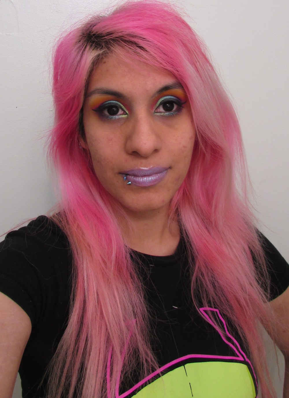
And now on to some looks.Also of these I used Nyx white eyeshadow base, nyx primer, and sometimes Too Faced’s Divinity for my brow bone.
Matte rainbow look


So I used the pecan color first and later appled the white shadow base , let it set a bit , and the applied colors. I decided on keeping the bright yellow and orange near my lid. they sort of blended together , but I liked the look overall. I then added the pink, purple and jade color. The Jade for some reason didn’t show up as bright as I was hopping but it still looked nice for my rainbow of mattes.
Sunset beach and water look

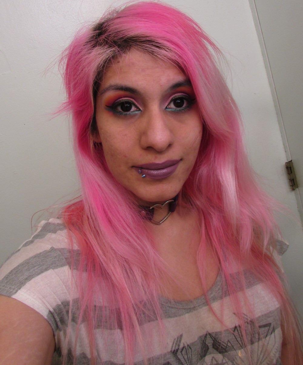
So this look I really wanted to use the duochroome peachy pink color. I decided to start off with the bright pink/magenta shadow and some of the purple near my crease.. Using a fluffy brush I blended it out and added a bit of the yellow on top. it actually blended too well and came out a bright orange. afterwards I added the nice duochrome peach/pink to my lid. I still wanted more color so I lined the bottom of my eyes with white shadow base and drew on the jade color. I wanted to have a nice double liner look. I finished up with a black liner and mascara as well a mix of greige and brown lipsticks.
Rainbow Fish look
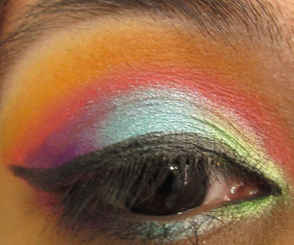
So this look kind of reminded me of the children’s book about the Rainbow Fish. I decided to go all out and use every color almost. I started with the tangerine color first, blended the yellow on top of the closer to my brow. I then tried to cut the crease with the white eyeshadow base and used my liner brush to draw a line with the magenta pink. afterwards I patted the purple into my V and placed the metallic cyan color as well as the lime color on my lids. I didn’t know how to line the bottom and just decided on repeating the purple,cyan and lime. I really liked how bright and bold this look was.
I was so happy with the colors and how well the shadows applied that I will for sure be trying out more palettes from this company. I liked the pan size, price and quality with maybe the exception of the jade color not quite working like I wanted. I would definitely recommend this palette to those wanting a bright palette, rainbow colors, or just soemthing a bit on the adventurous side. I think in the future I would like to try either the Douce palette for its nice pastel color story or The Nubian 3 Coral palette with its mix of corals, peaches and greys. But then again I may have to try out Smoovegal’s Egyptian Paradise palette too. It’s also on my wish list as well and has a similar color story to the Juvia’s Place palettes. Well thanks for reading and hopefully if I don’t get too busy this month I will have more reviews up.


I’ve been looking at Juvia’s Place for a while now, and Zulu is definitely one of the palettes that intrigues me the most. (So is Douce, actually!) I’m really glad that it works so well for you, and I love the looks you created!
LikeLiked by 1 person
Thanks ! I plan on granbing Douce in the future . I was really pleased with the formula . And yeah I believe this week its 60% off a Juvia’s palettes so Zulu may be on sale as well .
LikeLike
This color story is so pretty and the looks you did cams put great!
LikeLiked by 1 person
Why thanks ☺️ I wanted to add a few more looks but I’ve been so busy with the holidays . And yeah the color story is great , I can honestly say I like all of the colors and will try to use them with other colors in my collection .
LikeLike
I have this palette and I love it.
LikeLiked by 1 person
Its so much fun !
LikeLike
This is so pretty ♥️
LikeLiked by 1 person
Its a really nice palette , definitely one of my favorites .
LikeLiked by 1 person
I love this palette myself!
LikeLiked by 1 person
It’s definitely one of my favorites now . The colors are so pigmented and fun.
LikeLiked by 1 person
The colours look amazing on you!
LikeLiked by 1 person
Thanks! I still need to upload a few more pics . Its a really fun palette.
LikeLike
So pretty!! X
LikeLiked by 1 person
Thanks ☺️
LikeLiked by 1 person