
*These products were gifted to me from Influenster and Urban Decay Cosmetics in exchange for my honest review.
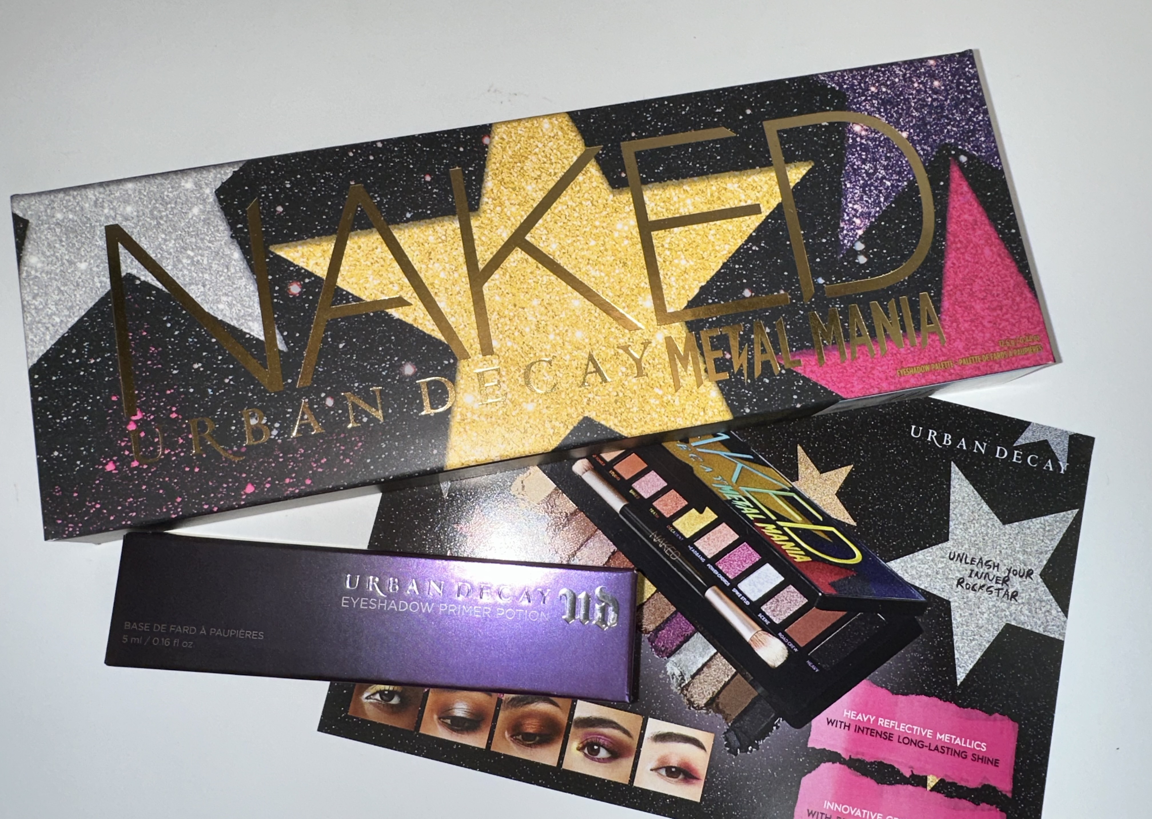
This was a pretty nice surprise! I got another Voxbox , and this time it’s an Urban Decay palette plus primer potion . Also this is my first Naked palette , I passed on the original Naked palettes as I thought they were a bit too neutral for me and my style . Also I was more of a fan of Too Faced’s Chocolate Bon Bons and other neutral palettes . So it’ll be interesting to try this out .

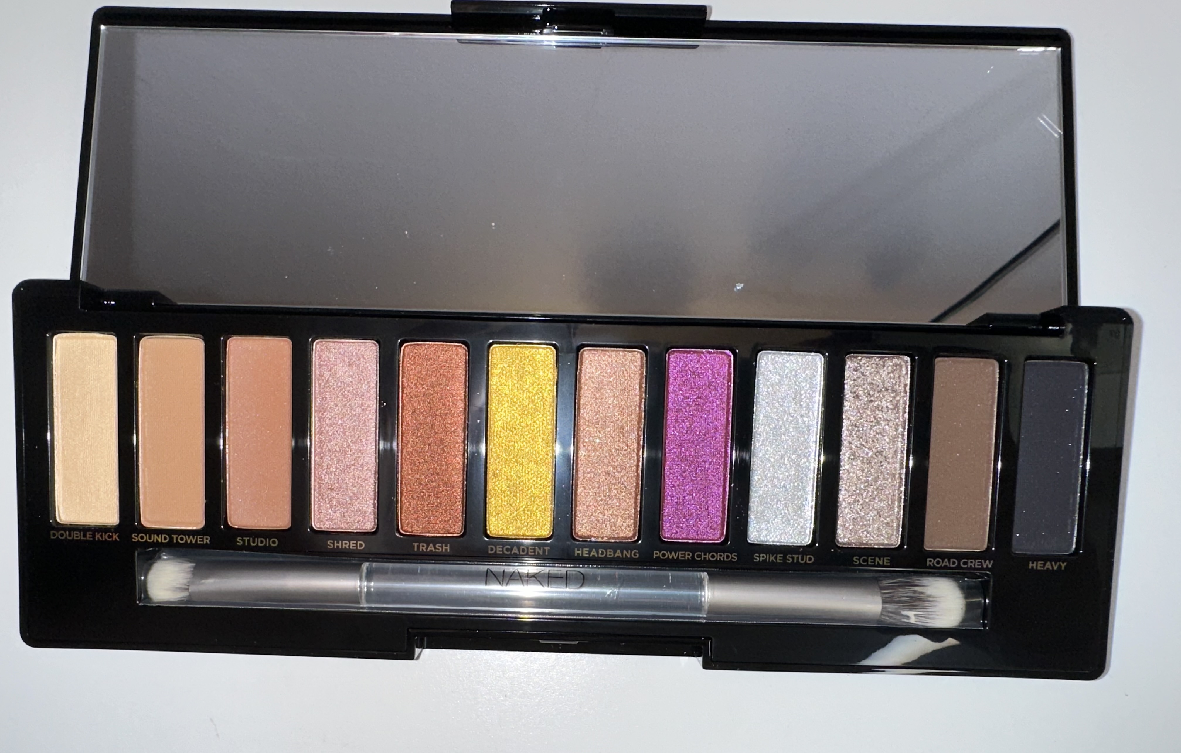
I’ll get this out before I continue with the review . But this palette has gotten quite a bit of criticism from others in the beauty sphere . Checking out comments on Reddit , Trendmood’s Instagram post , or even on Temptalia’s comment section , you’ll see people asking what is this ? Many were disappointed that it’s yet another Naked Palette , as well as the color story , the glam metal theme , and possibly reoccurring shades . As I don’t have the other Naked palettes , and I really only own three other Urban Decay palettes , I’m not too bothered. But I do think they went a little safe with color story . It’s 80’s glam metal , but where is the blue ? Why are the naked shades so pale , why do the stars on the palette contain colors that aren’t inside the palette? So many questions .

 One more criticism why Metal Mania ? It seems a bit cheesy , I feel like if they wanted the 80’s theme they should’ve gone with Glam Metal . It’s to the point and people will get the theme . And while Glam Metal is niche now , there are a few models on Instagram that really like that aesthetic and dress like 80’s hair metal girls . So cater to that base lol .
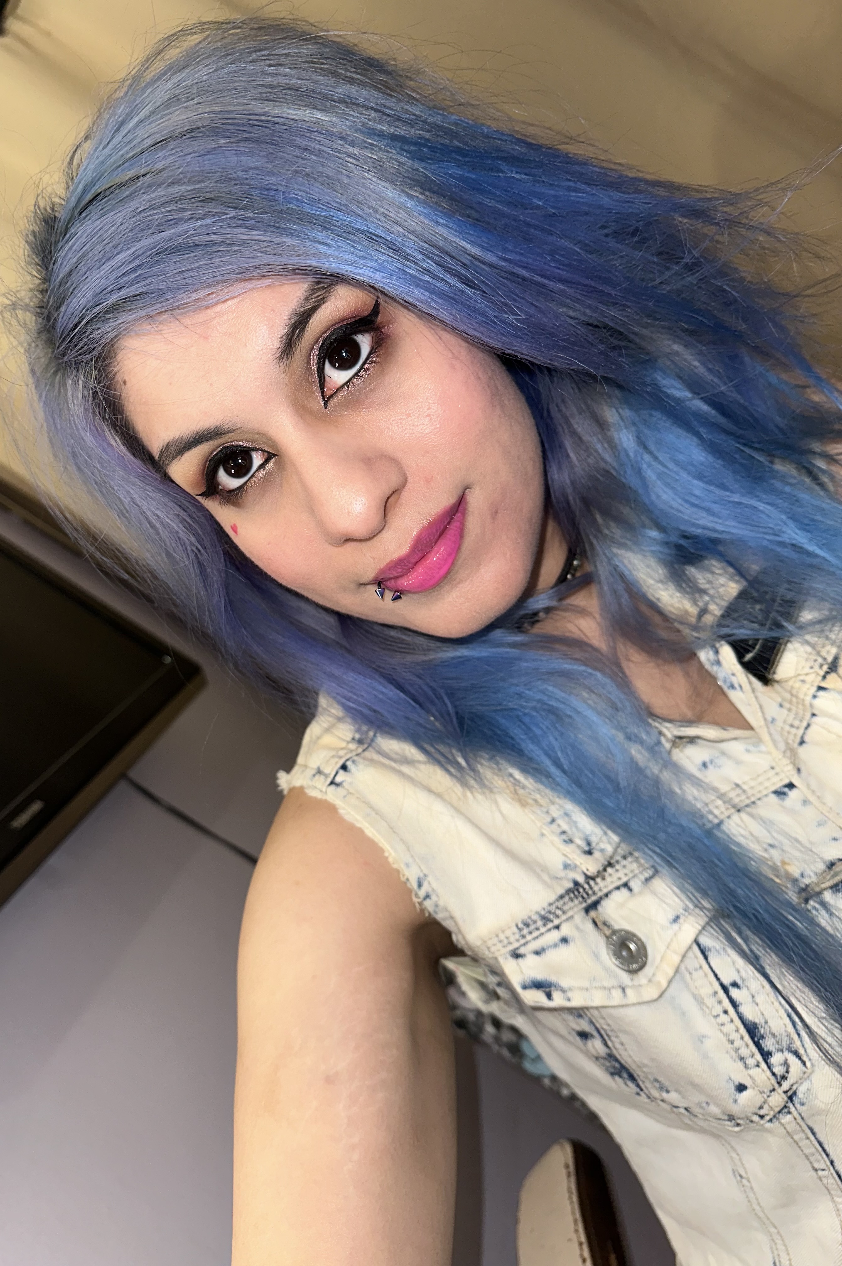
I tried to do my best to capture the colors and shimmers .

In my opinion I like the half of the palette starting with the shimmers all the way to the dark ash brown and the black . The three nude shades are kind of whatever to me . I have better nudes in my collection and they seem like they’re in every Naked palette. Also I do think the copper (Trash) should’ve been swapped for a blue . It’s 80’s glam and there’s not blue . Also the megenta is also strange , I would‘ve made that a hot pink . The shade studio could’ve also been replaced with matte pink or purple . And I’m not really feeling the yellow gold as I didn’t really see too many yellow gold shades used in 80’s Glam makeup . But then again maybe I’m wrong .
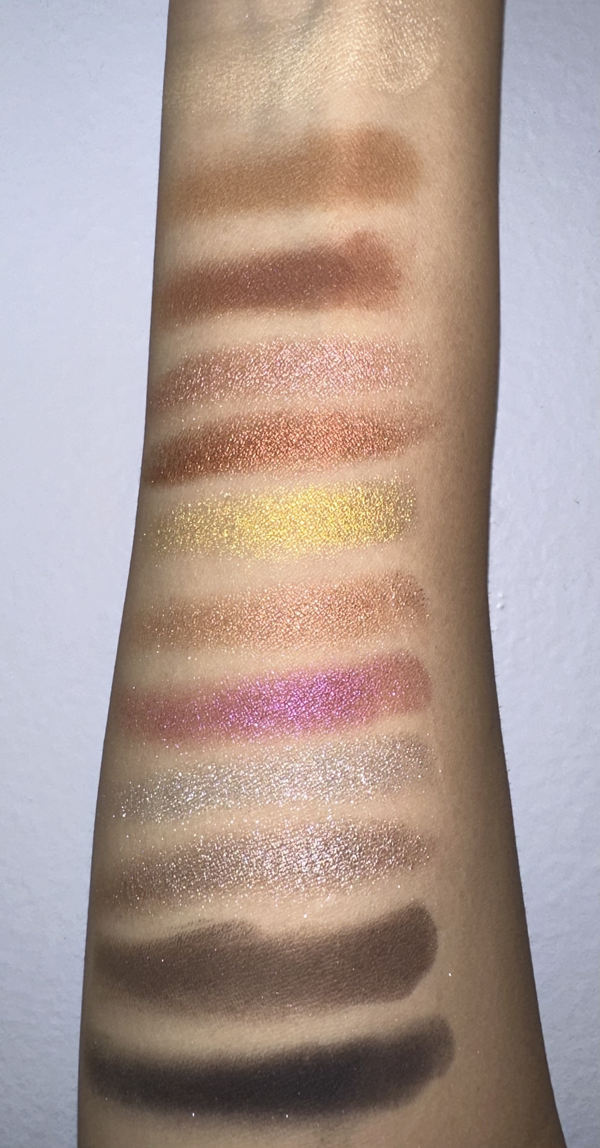
And now the swatches . The three neutral shades on top were very sheer . Buildable but still light, the top double kick is like this vanilla pearl , but it barely shows up on my skin . And I later tried to use it in an eye look and it’s still pretty ghostly . The metallic shimmers seem to be much better quality but do have fallout . I feel like this is a very gold , copper rose gold dominated palette with the silver and pewter just kind of being there . And the megenta was a bit patchy . So I’ll try these all out layered on top of the Urban Decay Primer potion . I’ll also give its own review too .
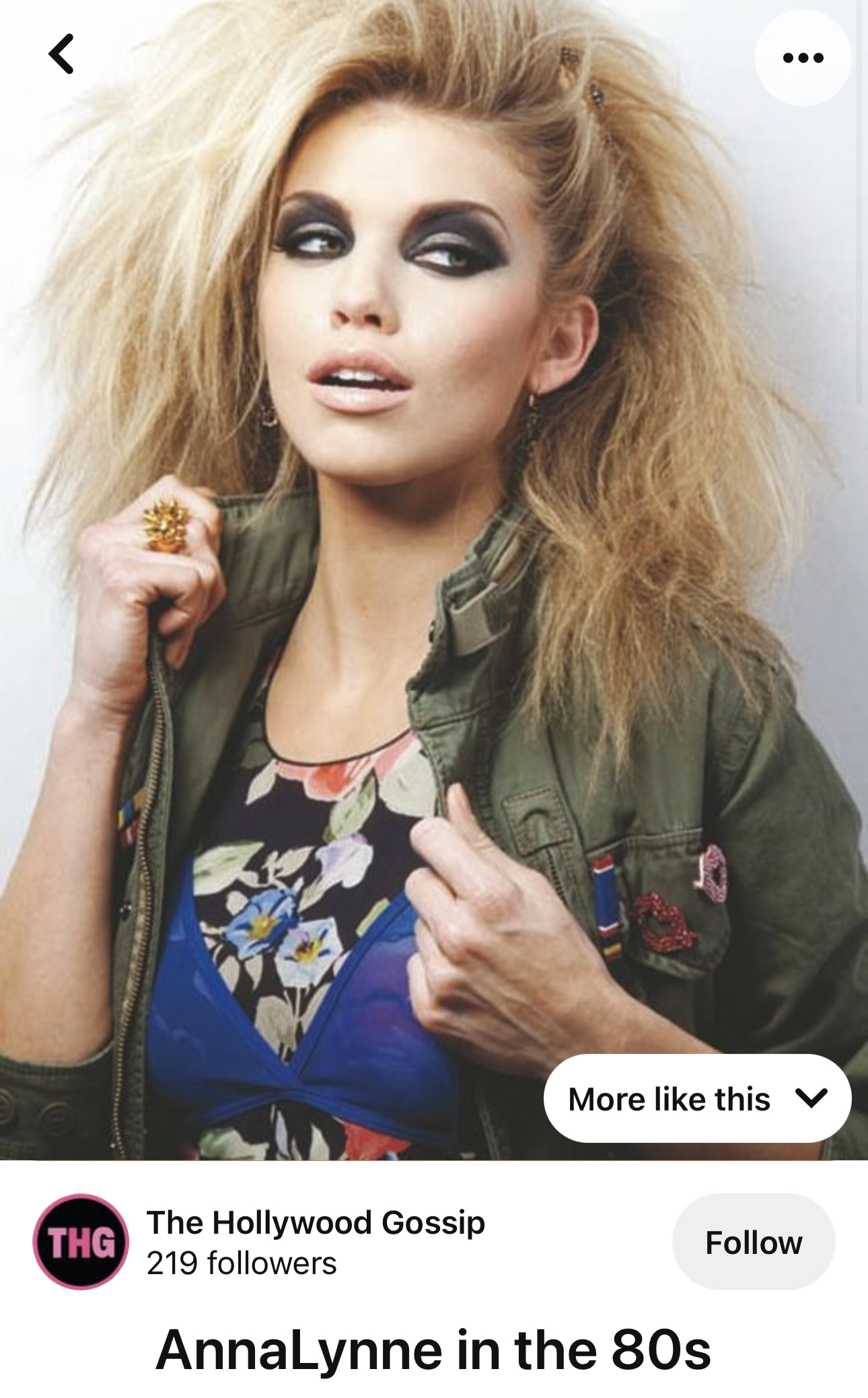
And I’ll post my inspiration picture! This is from a model/actress 80’s inspired photo shoot . I thought I could try doing a nice dark eye look and also tease my hair a bit .

I used studio for the top and blended it out , as well as double kick on my brow bone . These really just kind of blended to nothing in my opinion. Not a fan of these neutrals . Afterwards I started placing my dark ashy brown shade (Road Crew) and kind of made a shape . Later I picked up Heavy and blended into Road Crew as well as lining with Heavy , using it on my lower lashes too . It’s a bit patchy so the first eye came out like above . But my second eye was super patchy.
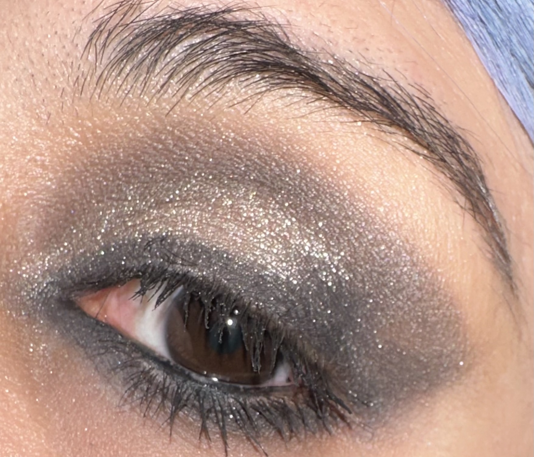 I forgot to note the eye above this one had a section that the blak kept fading. I got a little teary eyed when I went out , due to allergies, and my tears definitely made the eye run. Super sad. I don’t usually have this issue with other shadows. But of course this could’ve also been due to the primer potion. Nyx jumbo pencil in milk tends to make my shadows unmovable .
 So I went back and re applied the shades Road Crew and heavy. But they were still patchy. Oh well I take that’s just the thing with this matte formula. On a high note though, Scene is a wonderful pewter shimmer and looks amazing. It does have a bit of fall out but that could be mitigated by using a stickier base. Nyx glitter glue is great for that.
 I wanted to go on theme, so hairspray, army green clothing and light milky pink gloss .
 I had fun with this look to be honest. Plus I may be getting closer to my target powder blue pastel.
And now on to our next look . It’s time for strawberry lemonade vibes !
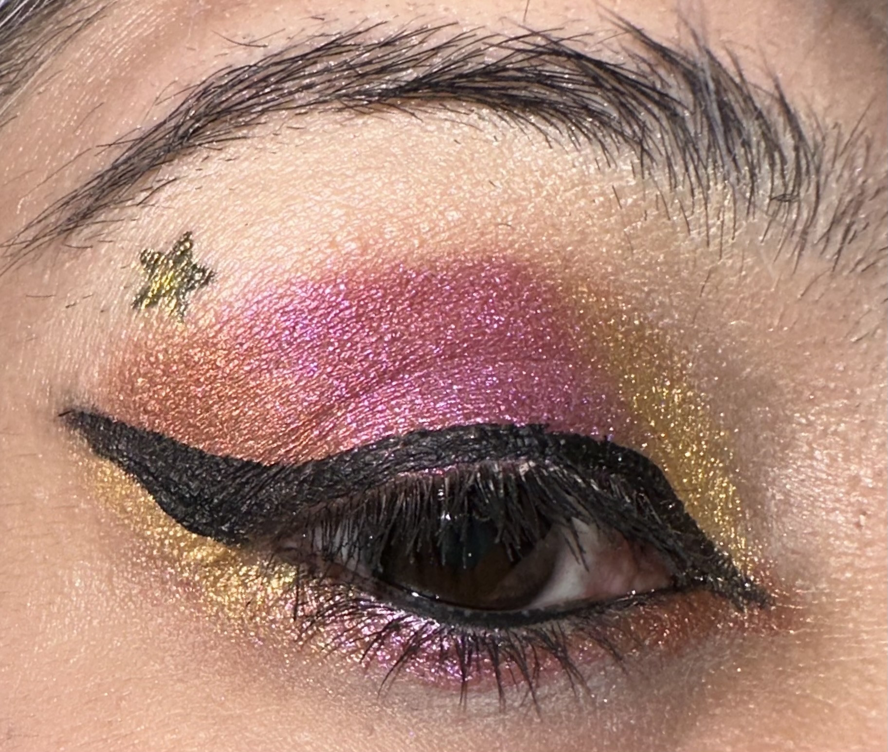 It was also time to experiment with a different base. I used the primer potion allover the eye, but I wanted a more defined wing/V area and I wanted to use the matte shade Studio again . I applied Nyx jumbo pencil in Milk in that corner . And then later Studio , blended it out . It was still kind of sheer and blended to nothingness , but there was a hint that it was there. So the mattes might just work better a white base . Afterwards I used the bright orange/copper, Trash and placed that in the V area as well as the bottom my corner . Next up was the megenta shade, Power Cords. This shade was a bit more prone to sheering out so I kept going over it with my flat brush, and also added it to the bottom of my eye. And finally Decadent , which was also used on top of the stars . This yellow/gold is really bright, super pigmented, and while having a bit of fallout, still applied nicely.
 I think the metallic shimmers are the star of the show when it comes to this palette and if you wanted to grab the palette for the shimmer I could totally see that.
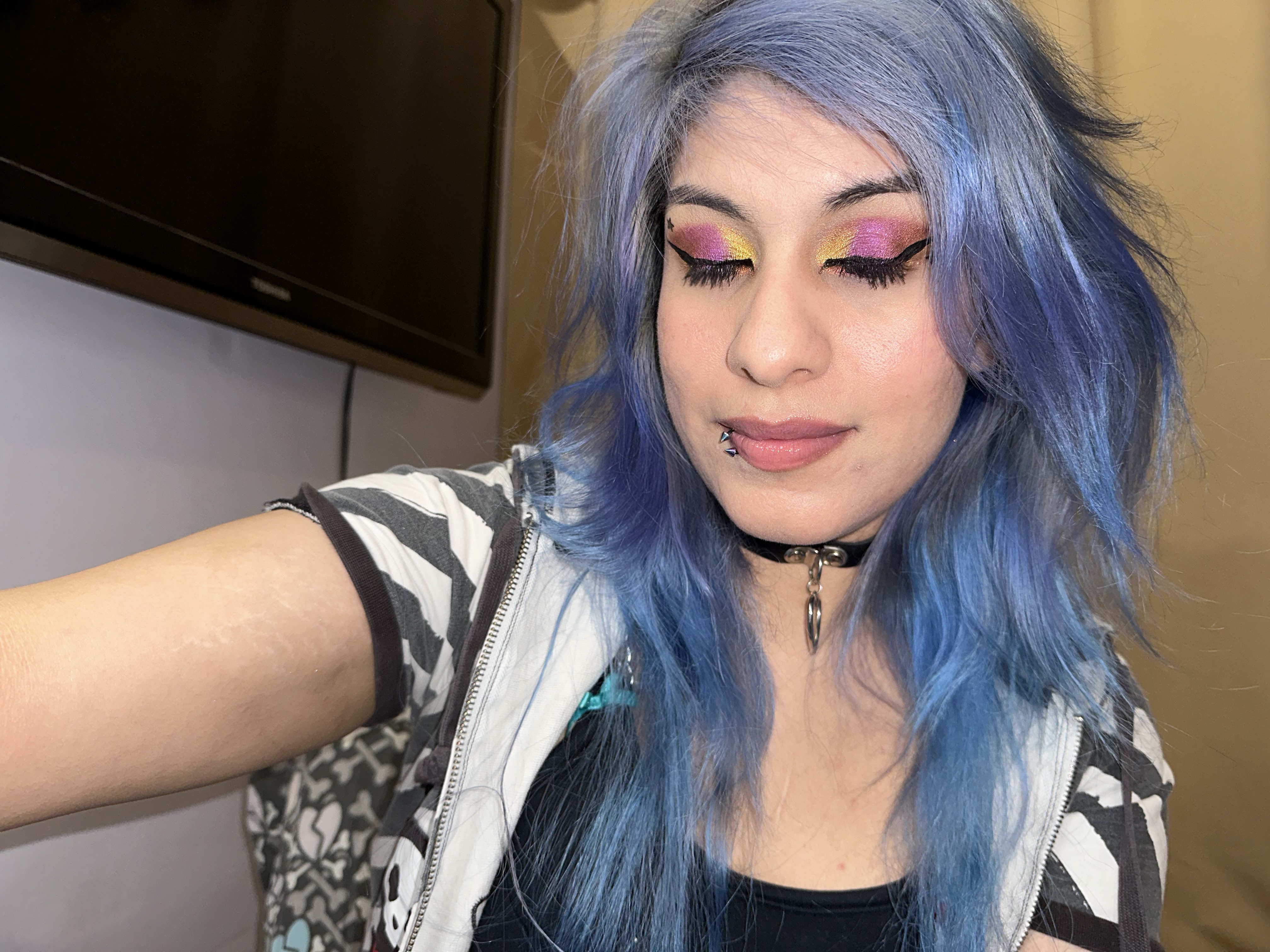 Honestly I liked this look better than the first, aand I should’ve probably did the tiktok with these colors. I didn’t know I would like the megenta and the yellow gold as much. Also I found out I liked the Ilia mascara alright , but I hate the brush, so I used the Light’s, camera, mascara from tarte’s brush and it came out better. Sometimes it pays off to save the wands from other mascara tubes.
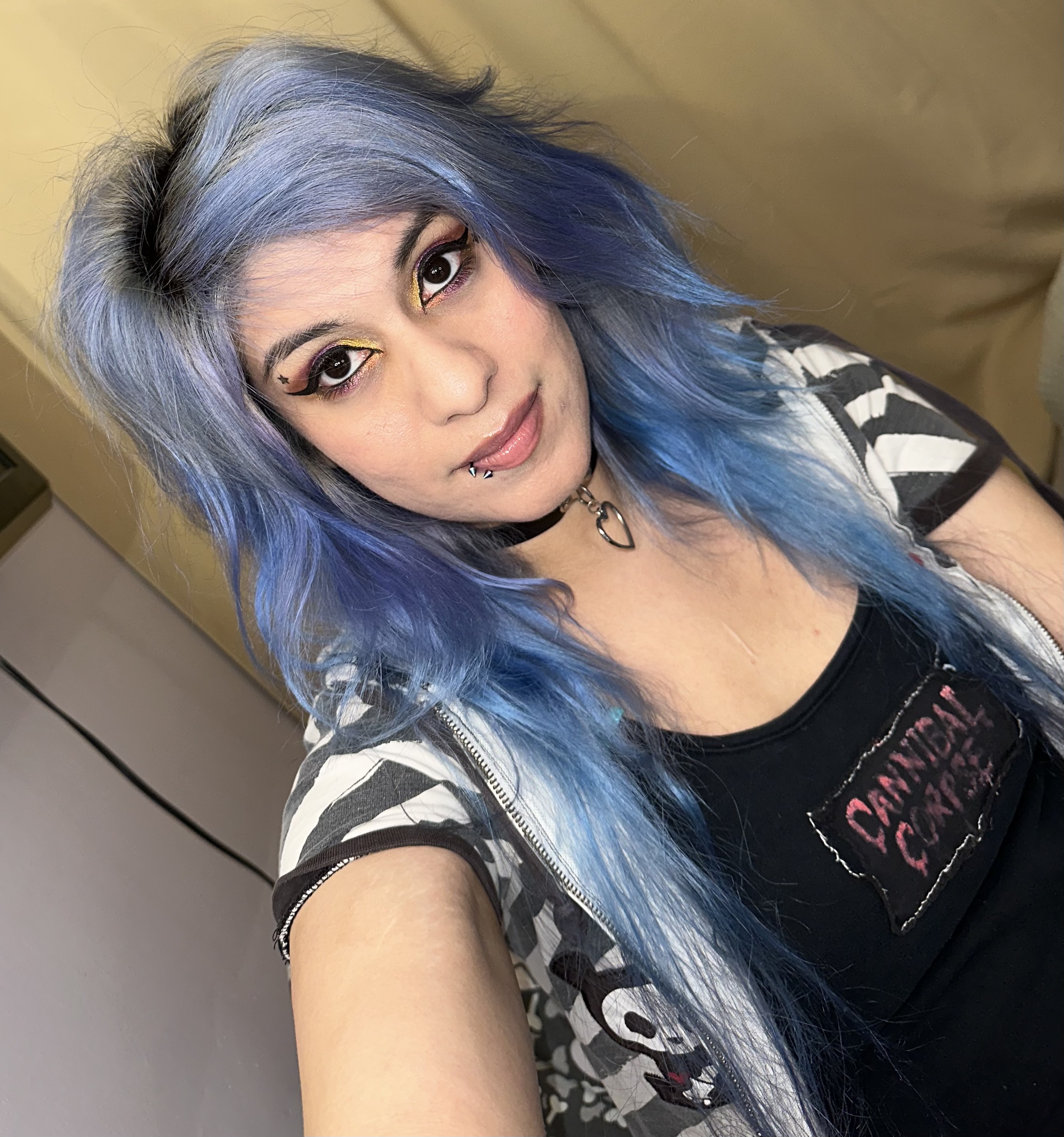 I just liked the way these colors meshed together. Even that orangy copper that I was skeptical of. It does need a better name though Trash? Why not Thrash? sounds way better.

Next look is a tribute to Neil Gaiman’s Sandman’s Death character ! She’s pretty cool and one of my favorites so I wanted to do a look based on her iconic eye look. I also wanted to glam it up a bit so I added the silver metallic shimmer, Spike Stud. These came out kind of sheer . But that’s okay.
 I only used three shades , Double Kick on the brow bone, Heavy for the liner , and Spike Stud. The liner I used Nyx Jumbo pencil in Milk to basically line out my design , and later used a liner brush to pick up Heavy. Heavy isn’t that dark to be honest. It also has a slight bluish undertone. I probably wouldn’t have noticed unless I used the the white liner as a base. I felt like I needed to use alot of Heavy to get the black just right. I do like the more softer look though. It’s just still a bit patchy.
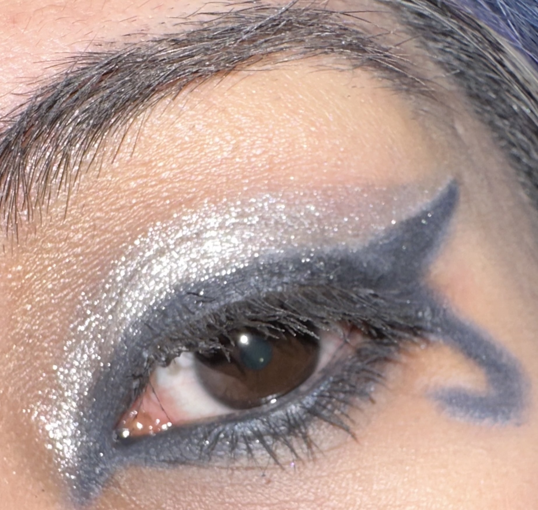 This eye is meant to look like Death’s iconic liner. I feel Spike Stud looks less sheer here. But heavy looks a bit more faded. And Double Kick is only really noticable due to the pearl finish. And back on to Spike Stud, I felt like I had to keep dipping my flat brush to get decent coverage. Maybe a finger and stickier base would’ve helped. I was again using Urban Decay primer potion. Next time I’ll try the Nyx glitter glue.
 Photo added for those who are unfamiliar with Death from the Sandman comics . She’s a pretty happy personification of Death and sister of the God of Sleep . I didn’t rock the belt and black jeans but I had the top and the ankh. Which was a gift from my Mom long ago .
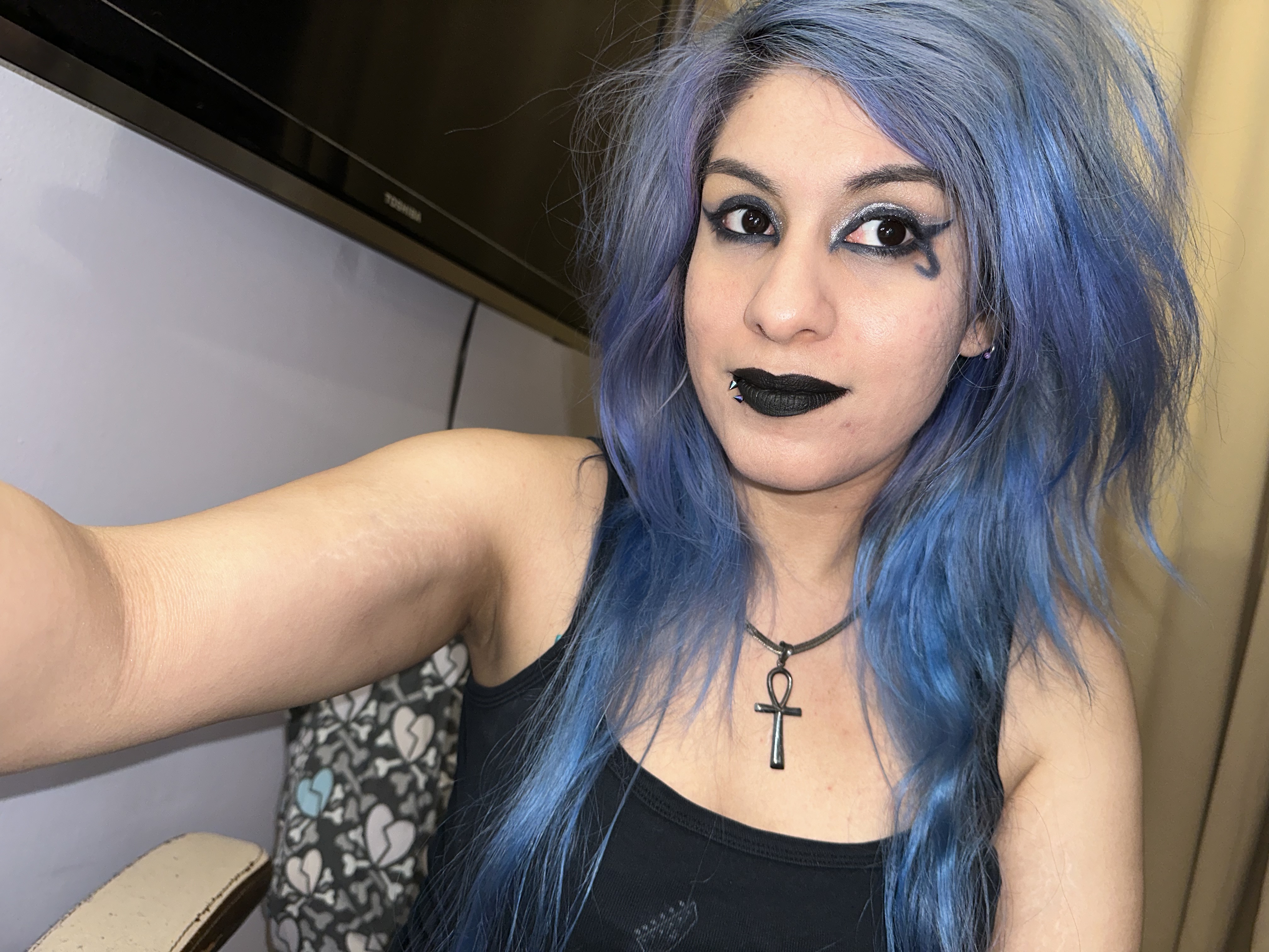
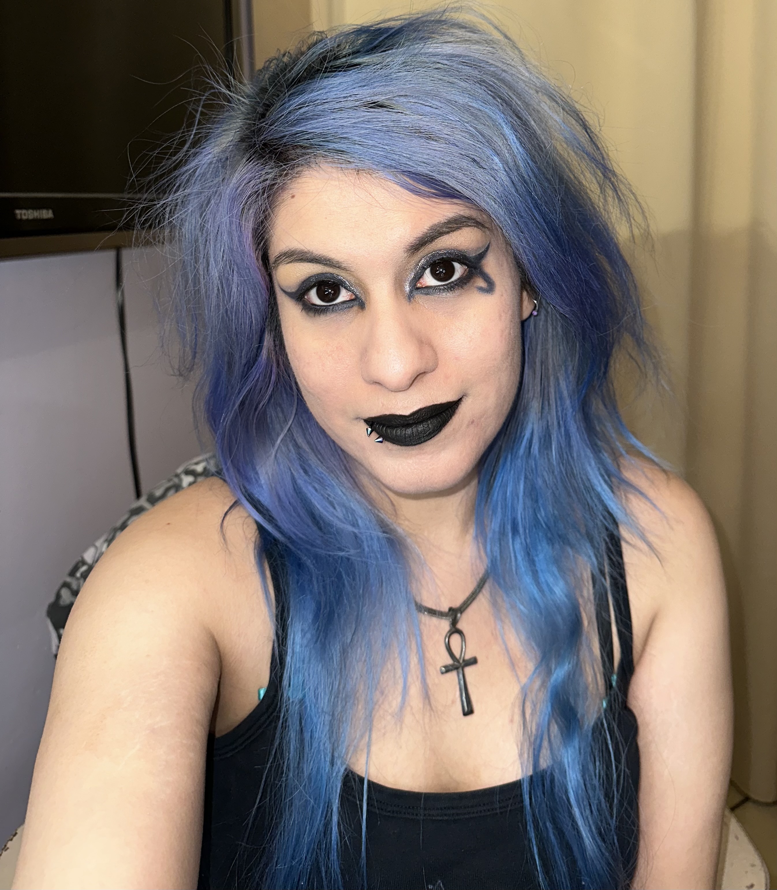 And can you believe I’m running low on Sugar Pill Zero black lipstick . Nope I’ll have to order more as this is my favorite black lipstick ever. So while I was happy with how the look came out, I feel like this palette needs grey badly. Next time I wear Silver Stud , I’m using a few grey shades from my mini Juvia’s Place palette . That or a few of the more cool toned shades in the Chocolate Bon Bons. I know Grey isn’t Naked per say but it is a neutral. Alrighty on to my last look .
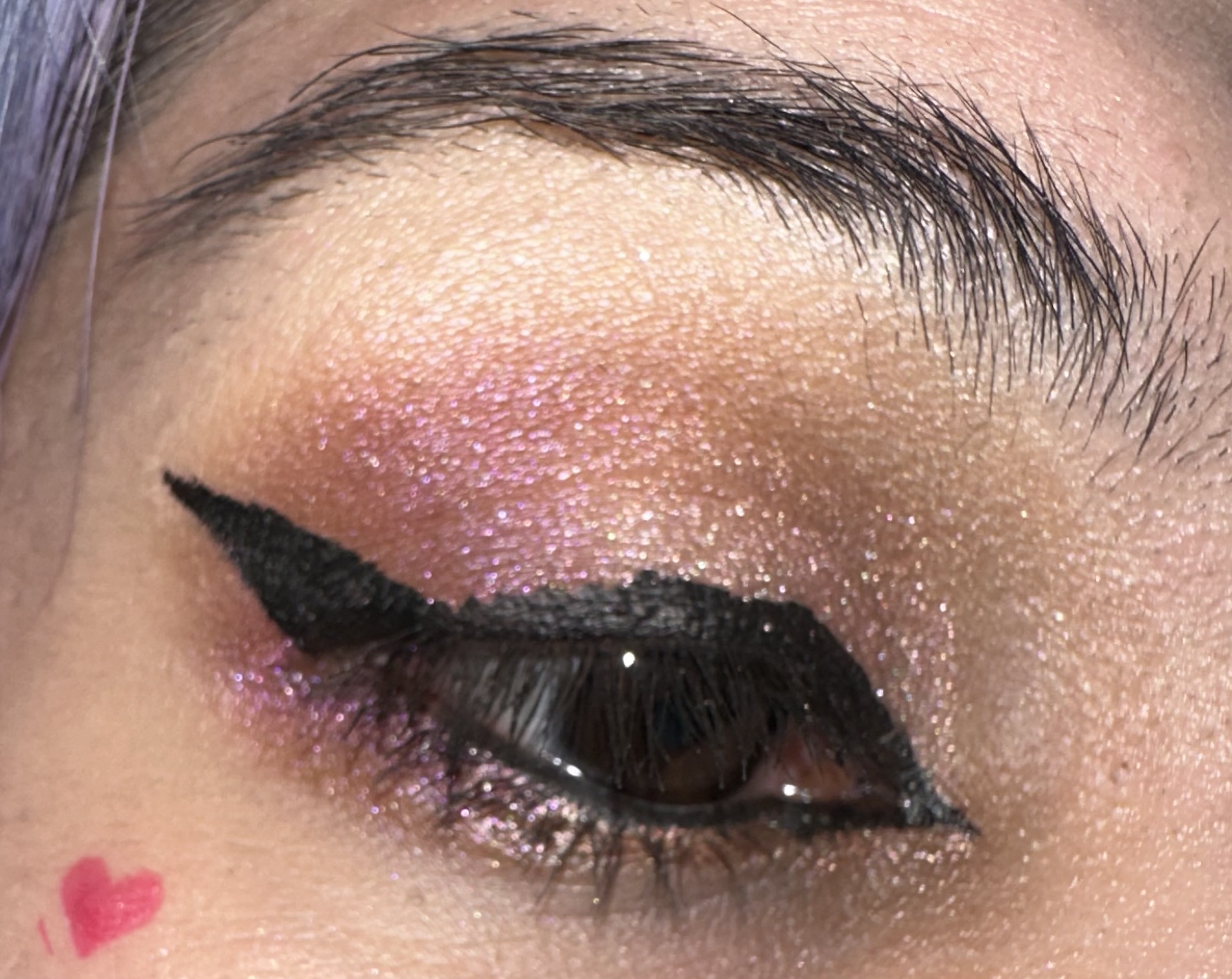
Let’s go soft glam , or as soft as I can with this look . I initially wanted to use just the neutrals , plus Shred ( soft rosé champagne)and Headbang the rose gold metallic . But I thought the look was too boring so I blended in the magenta shade, Power Chords in for more color .
 I really liked how this came out. It’s still pretty soft. Shred is a lot softer of a color than i thought , but it reflects light very well, the bottom I lined with headbang. This was a bit darker and more metallic. you can kind of see a bit of Power Chords reflect as well.
 I actually missed up my liner , so excuse that, but I feel like this picture you can see the colors even more. But sadly I did come up with a personal dilema , I could’ve recreated this with my quite a few of my other palettes. This isn’t necessarily the palette’s fault, or my fault (as this was gifted to me through influenster ) but I feel like if you have a large eye shadow collection this will definitely happen.
 Also it was Battle Vest time ! I do need to add some more patches and buttons, but I’ve been debating for years on which music artist gets the coveted backspace. Initially it was going to be my all time favorite Children of Bodom , but I may try to track down a rare Gangsta Boo large patch as well. I’m a huge fan of Three 6 Mafia and talked a little bit with Gangsta Boo. She sadly passed earlier this year, So I think she deserves the full back space. I’ll probably still find a nice looking Children of Bodom patch to place somewhere as their still one of my favorites too. So as for the look I decided to go Barbieisque! Let’s go bubblegum pink gloss and some pink blush!
My final thoughts on the palette, the best part of it is the metallics ! and the two wet look shimmers are the silver and yellow gold . Those I think are the main selling point in this palette. The pewter is also a nice addition and really pretty , but the thing that made the palette weird for me was the matte’s. I just don’t think Urban Decay’s matte formula is as good as it used to be. You can check my Stoned Vibes review. It was a really pretty palette but the neutral mattes really dragged it down for me. I love the palette and use it quite a bit now but those matte’s just get ignored for the most part. I feel very similar with this palette, the metallics are the strength, but those mattes are not the best. The three lighter neutrals were pretty powdery sheer , and the darker ash brown and black were hard to blend and sometimes patchy. Plus if you have a large collection you may already have a few of these mattes already. As for the color story, yeah it was roasted quite a bit online , but it’s not bad , just probably something you have seen already. I think when it comes to similar neutrals , I like the Too Faced formula a little better . Yeah they’re still a bit light but I feel they build up a little better. I’m also doing some thinking and I may just see if one of my friend’s wants this palette as they don’t have as much makeup but I feel like they would get better use out of it . Definitely more than me, aside from that amazing silver , I can dupe quite a bit of this palette already. Well let me know what you think and if you like this palette , or if you would skip it. I’m really interested in what you all think .

💙💛
LikeLiked by 1 person
Thanks so much ✨
LikeLike
I was a little confused by the criticism I saw online about the color story as well. Some people saying there’s nothing “naked” about it, but other than the yellow and purple the rest are pretty much neutral. A palette of 10 neutrals out of 12 is surely enough to fall in line with the Naked series, right? lol. I like the looks you created with it.
LikeLiked by 1 person
Thanks ! I do think most of the color are very neutral and I was confused when a few said it was a wild color story . It really only has two pops of color . I do think there’s something’s that could be approved but it’s not quite as bad , just ilI wish the darker shades weren’t as patchy . Since those are the neutrals I would use the most.
LikeLiked by 1 person
Omg, beautiful 😍
LikeLiked by 1 person
Thanks so much ! The shimmers are the best part !
LikeLiked by 1 person
Thanks for posting Death from Sandman. I read a few of the Sandman graphic novels and a lot of the comic books from the 90’s. One of the best comic books of all time I think.
LikeLiked by 1 person
I’ve read a few as well . I also liked The Maxx , forgot who the writer was but the story was so good . Great 90s comic
LikeLiked by 1 person